CASE STUDY
Wander
Helping Airport Travelers to Purchase Items On-the-Go.
Balsamiq lo-fi screens for the Wander mobile website.
The purpose of this project was to determine what airline travelers had in common and their pain points so we could use that data to build and test the information architecture for a new airport gift shop mobile website.
Home screen wireframe built in Balsamiq.
PROJECT
Mobile-first Ecommerce Website UX Design and Information Architecture.
PROBLEM
Busy airline travelers are limited to in-person airport shopping, they need a way to order what they need ahead of time.
*Steps taken on this project were limited in scope.
*Steps taken on this project were limited in scope.
SOLUTION
An easy-to-use and accessible mobile website to order, pay for, and pick up items on the move.
ROLE
Research & Design
Krista Volenski Wilcox
Krista Volenski Wilcox
Research
Wah Khalsa-Smith
Justine Mariscal
Wah Khalsa-Smith
Justine Mariscal
PROJECT ELEMENTS
Research & Discovery
User Survey, Mind Map, Content Inventory, Card Sort, User Story, and Tree Test.
User Survey, Mind Map, Content Inventory, Card Sort, User Story, and Tree Test.
Design
Hierarchy, Site Maps, Wireframes, and Prototype.
Hierarchy, Site Maps, Wireframes, and Prototype.
TOOLS
Pen & Paper, Google Survey, Facebook, XD, Optimal Workshop, InDesign, Photoshop, Balsamiq, Marvel - Design & Prototype.
⇨ Follow the letters to see how our research connects to my designs.
Preview the Wander App Design Below.
Research & Discovery
Survey
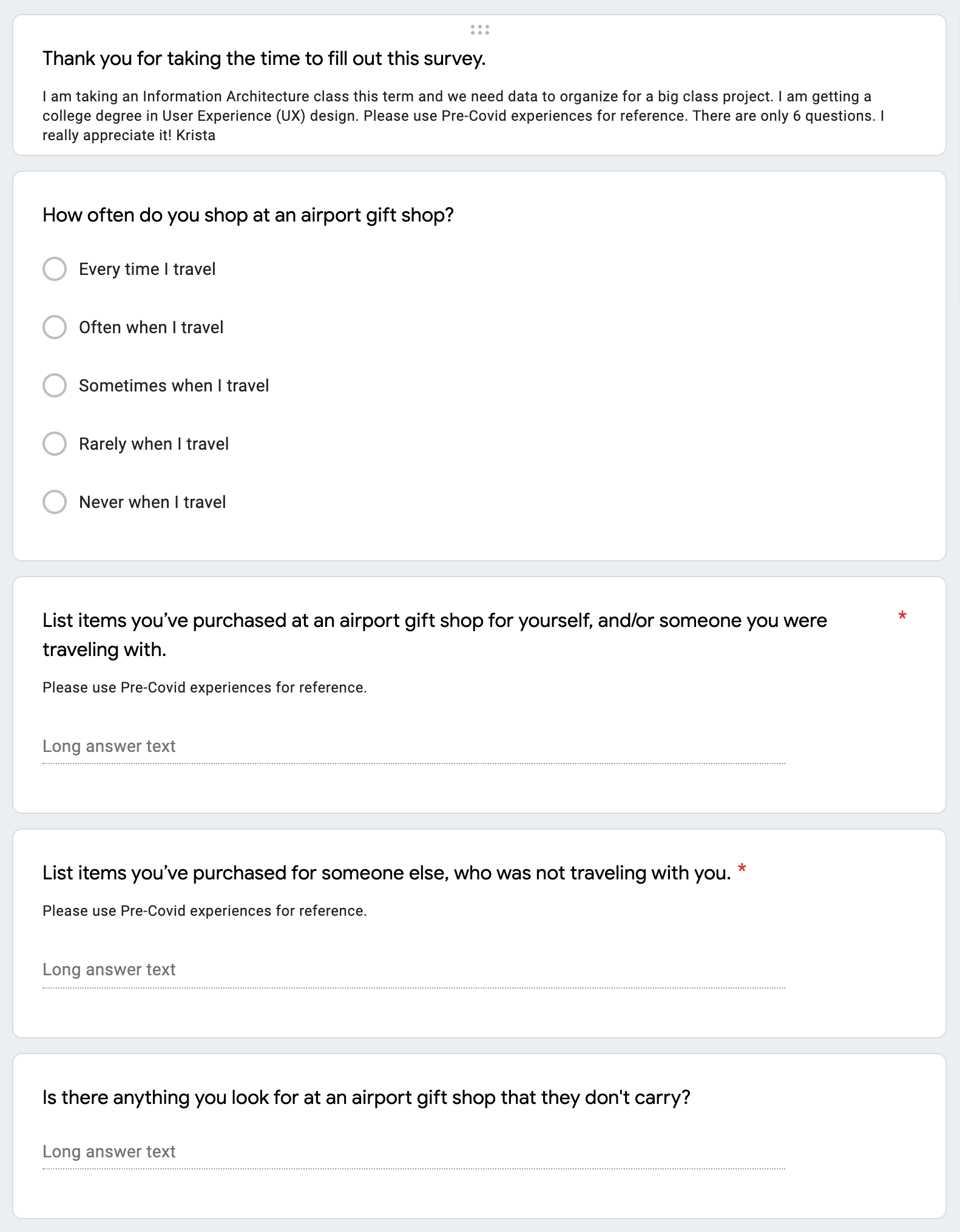
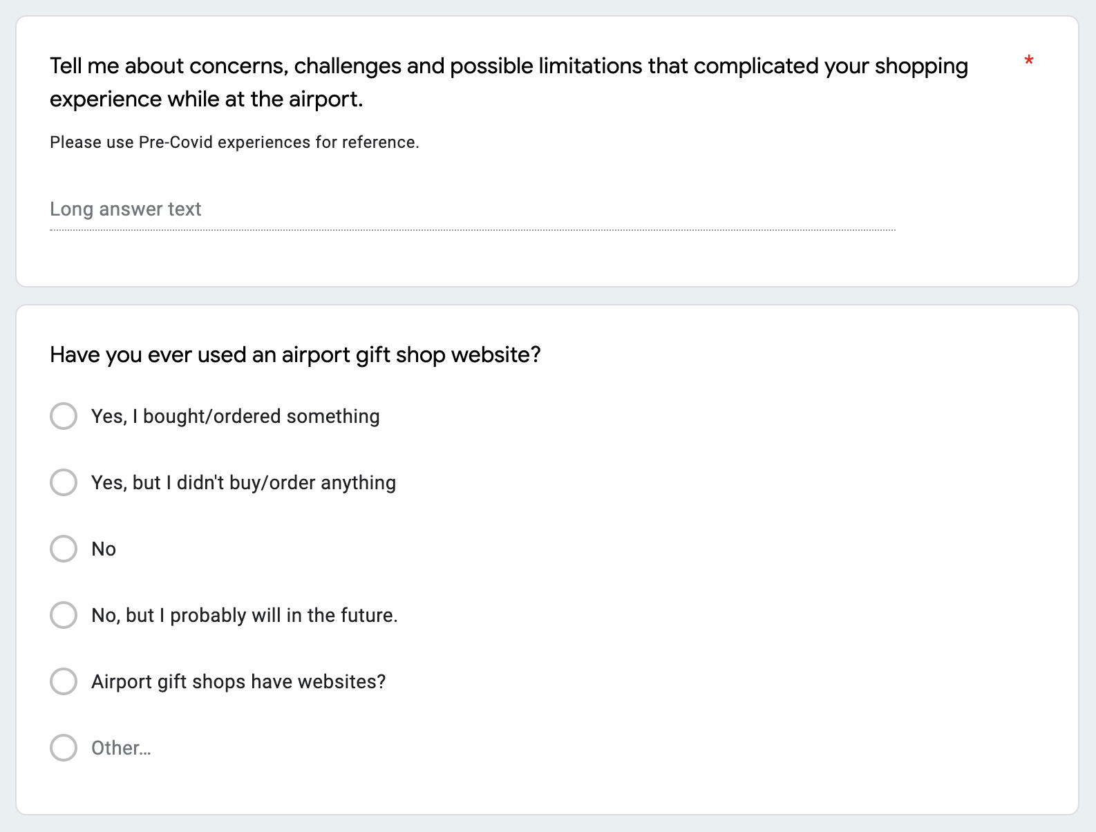
10 participants answered six questions distributed via Google Forms and Facebook.

Analysis of Survey Data
A.
Participants looked for items
in 7 categories
in 7 categories
29% Food & Drink
22% Souvenirs & Gifts
16% Fashion
14% Entertainment
10% Toiletries
8% Travel Supplies
2% Duty-Free
Top 5 items
1. Books
2. Magazines
3. T-Shirts
4. Candy
5. Snacks
Each of the top 5 had six mentions.
21 items ended up on more than one researcher's list of top words after creating Mind Maps.
21 items ended up on more than one researcher's list of top words after creating Mind Maps.
Data analyzed was a combination of mine and two peers’ data.
Mind Map
This mind map was created after reviewing the combined survey results. It shows a possible organization of items at an airport gift shop based on our data. Pain points mentioned in our surveys are also included.
B.
User Story
Lori is a 56-year-old married grandmother from Salt Lake City, Utah.
Lori is flying to San Diego to see her son and his family. Lori arrived at the airport early and is hungry and thirsty. She stops on her way to her gate to get a bottle of water and a snack for herself. The line is long, so she browses the store while the line dies down. While browsing Lori finds a cute plush toy for her 2-year-old grandson, Leon, that she knows he will love. Lori pays for her water, chips, and the plush bear. At the checkout Lori sees a sign advertising a new website for the shop coming soon. Lori thinks to herself that she will try the website the next time she is at the airport, it could save her time, then continues to her gate.
Based on an interview with Lori Perez who gave detailed answers to the survey.
Content Inventory
Top 30 most common items from team data.
Hybrid Card Sort
In Optimal Workshop four participants sorted our top 30 items into seven+ categories.
Insights
C.
1. Items may need to be placed in two categories if the user expects them to be in both locations.
2. Toiletries category can be eliminated, the items in it can be sorted into other categories.
Hierarchy & Site Maps
Using the card sort data, I created two options for the website hierarchy and site maps.
D.
Tree Tests
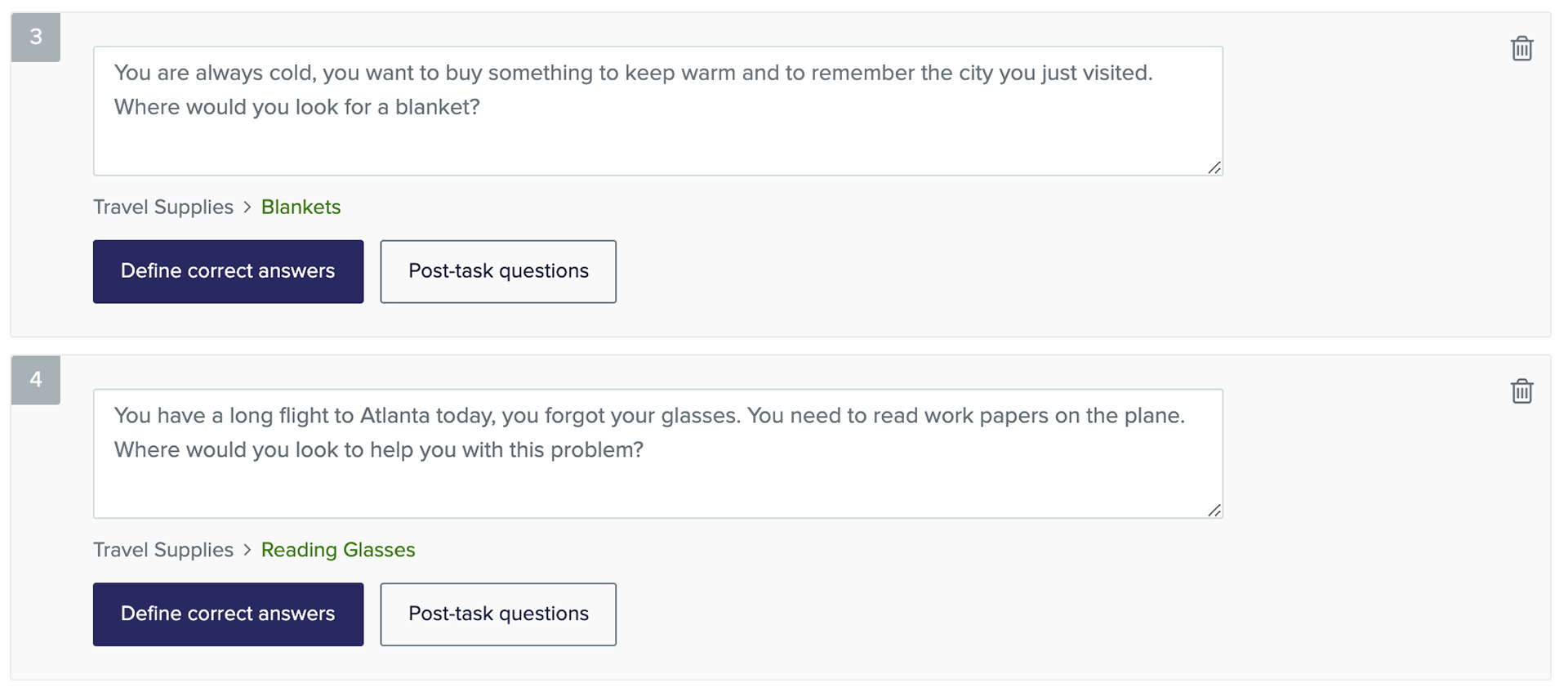
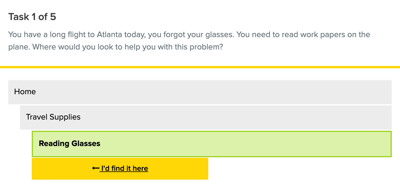
Using the two site maps, I built two tree tests in Optimal Workshop with five questions each to evaluate the site structure. 7 individuals completed both tests. Site map 1 was determined to be the easiest to navigate.
E.
Design
Rough Wireframes
Homepage, category, product screens, and menu options.
Homepage
Header: logo, shopping cart, and menu button. Page: promos, search tool, direct product, and category links.
Header: logo, shopping cart, and menu button. Page: promos, search tool, direct product, and category links.
Category
Product listings with photo, name, short description, star rating, and price.
Product listings with photo, name, short description, star rating, and price.
Product
Product name, description, images, star rating, reviews, specs, and a buy/add to cart button.
Product name, description, images, star rating, reviews, specs, and a buy/add to cart button.
Menu
Both site maps are shown. The straightforward one used in menus 1 & 3 did better during the tree test.
Both site maps are shown. The straightforward one used in menus 1 & 3 did better during the tree test.
Lo-Fi Wireframes
Five improvements were made incorporating feedback, this version was built in Balsamiq.
1. Added breadcrumb navigation.
2. Search bar now at the top of every screen.
3. Added a search results page.
4. Added a shop page with links to all categories and individual top products.
5. New bottom right button to make it easier to use the site with one hand.
Lo-Fi Prototype
A working prototype of the Wander mobile website was created using the Marvel app to show user flow, interactions, and navigation.
Would you like to preview the interactive Marvel prototype?
Test out the working prototype below.
What I learned and Next Steps
1. There is a large market for an airport gift shop website or app. All of the airline travelers we surveyed purchased items at an airport gift shop sometimes when they travel.
2. Many of their pain points could be addressed by designing a mobile website that they can access on the go at the airport.
3. Product education would be important, none of the users surveyed had used an airport gift shop website in the past.
4. I plan to go back and finish the UI design for this project when time allows.
Next time I work on a similar project I would like the opportunity to do the following...
1. More in-depth initial research into the users and the market we would be entering.
2. Professional usability evaluation of competitors' sites and testing by our intended users.
3. Usability testing of Lo-Fi and Hi-Fi prototypes by our intended users and analysis.
4. Creation of a design system with a logo, icons, components, colors, and typography.
Are you interested in working together?
I would love to hear from you!

