CASE STUDY
Typographics 2021
A brand for type lovers in two scripts (languages). 

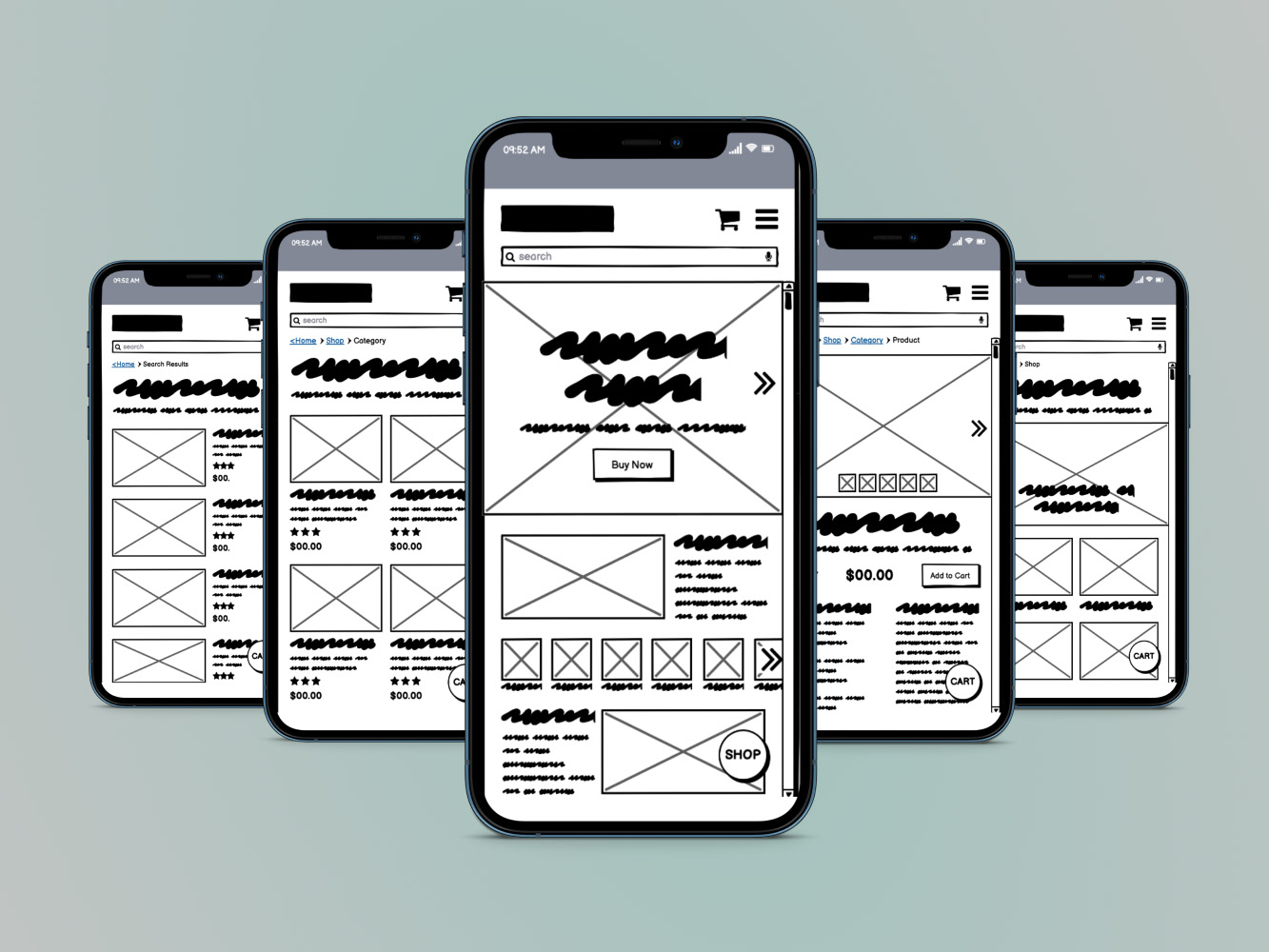
Screens from the Typographics festival landing page in two languages. The website toggles between Hindi and English.

This is a first for me, designing in two scripts! I love it when I get to stretch my skills and widen my knowledge. 
The goal was to design an approachable brand identity that would grab attention in India while at the same time feeling fresh when used in the US. To accomplish this I took a post-colonial approach in the selection and use of typography and color, embracing the culture and heritage of India and the Devanagari script. 
This design suite, particularly the mobile elements, has been designed with accessibility in mind. The type is larger and the contrast is higher for better legibility for a wider audience.
PROJECT
Typographics 2021 Festival satellite event in Hitec City, Hyderabad.*

OBJECTIVE
Design branding, print, and web for the festival in Latin (English) and Devanagari (Hindi) Scripts. 

PROJECT ELEMENTS
Logos, Type System, Color Palette, Mood Board/Research, Posters, Festival Passes, Festival Tote Bags, and Landing Page for Mobile.

ROLE
DESIGN & ART DIRECTION
Krista Wilcox
DESIGN PARTNER
Lesley Kriebel

TOOLS
Google Fonts, InDesign, Illustrator, Photoshop, Figma.


The landing page toggles between Hindi and English. 
PREVIEW THE TYPOGRAPHICS 2021 LANDING PAGE DESIGN BELOW. 

Screen recording of interaction with prototype.

Colonialism in Typography
First a little background. The Latin script and English language were spread around the globe as they conquered other lands, often pushing aside the script and language of the native peoples. A large percentage of typefaces on the market are in Latin only. Very few are available in both Latin and Devanagari scripts. 
Research
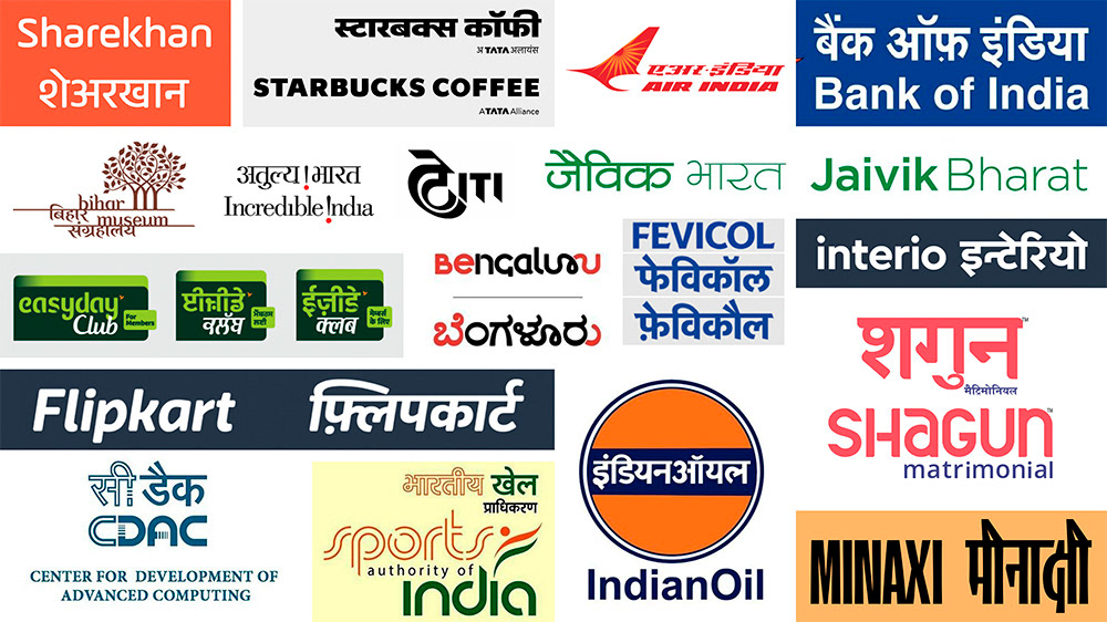
India has two official languages, English and Hindi, design and advertising are typically targeted toward one or the other. The class divide in India is the main cause of this language divide. The wealthy in India are taught English and the Latin script for writing. The lower class are taught Hindi (or another similar language) and Devanagari for writing. 
Logo Inspiration in Latin & Devanagari
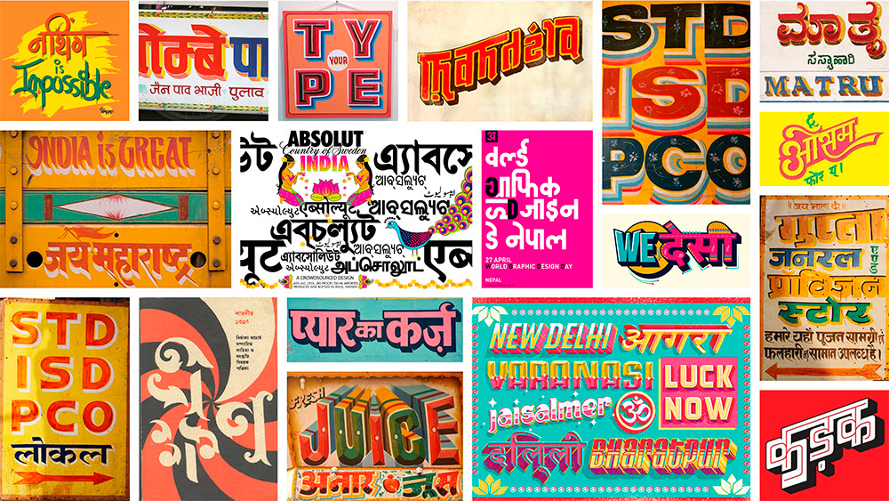
Indian Signage & Typography Inspiration
Fabric examples, used for color inspiration.
Type System
Working within the confines of Google Fonts, I choose Poppins for this project by narrowing it down to typefaces with both Latin and Devanagari scripts with at least three weight options. Poppins’ have italic options, but they are not included in this base system. I didn’t want to apply Latin-type styling across the board because Devanagari isn’t traditionally in italics. 

Sketches to look at the typeface Poppins while designing the type system.

Final type system design for Latin and Devanagari Scripts using Poppins typeface by Google Fonts. Contains styling for headers, subheads, body copy, captions, microcopy, and buttons/CTA.

Logo Design
Sketches created early in the process helped me get a feel for the look I wanted to achieve. I determined that I didn’t want to force an unusual break in Hindi, keeping each word on its own line worked best. I was inspired by the 3D effect in my research to bring that spirit into the logo.  

The main logo on the left can be used with or without the drop shadow. Additional secondary options on the right are designed to work at a small size.

Final Design System
The type system and logo options were set up as a CC library in InDesign and as styles in Figma that can be shared with other designers and applications. 

8.5” x 11” Typographics 2021 style guide

Team Collaboration
I gave my design system to another designer to work with and she gave me hers to use going forward. We each art directed the other on our designs using the other's system.

My design partner, Lesley Kriebel’s, type system and logos.

Poster Design
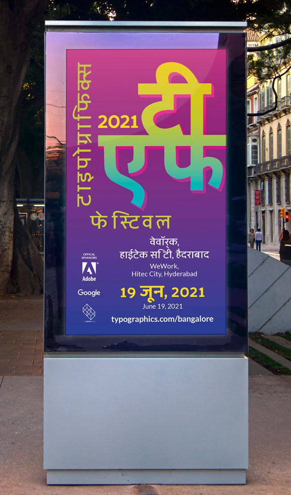
The festival needed a poster as part of the festival promotional materials that could be printed in both English and Hindi. This poster needed to work in both cultures.

Early versions of my poster design.

Final Typographics 2021 ops

Final color palette.

Street scene mockup of series of three posters.

Website Landing Page
Designed based on the poster with a mobile-first approach. The landing page will drive users to get tickets for the festival, find out more about the featured events and speakers, shop the store, and sign up for the festival email list. 

final event landing page after iteration

Final Landing page Hi-Fi Wireframe, Tool: Figma.
Would you like to preview the interactive Figma prototype?
You can interact below.
Additional Brand Elements
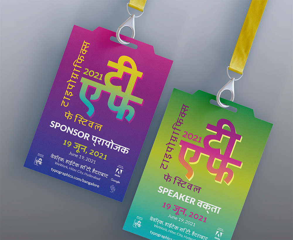
The design system will be applied across the board on advertising, badges, and totes.
Wrap Up
After spending eight weeks on this project I’m comfortable with working in multiple scripts going forward. I learned a good amount in regards to colonialism, accessibility, designing in Figma, working through issues with a design partner who doesn't have the same attention to detail as I do, and how to write a case study. 
If I could do anything differently it would have been to have done user interviews and wireframes for the rest of the festival website. This was for a typography class so that wasn't a portion of this project. 
Are you interested in working together?
I would love to hear from you!
Did you see my UX & UI Design portfolio?

You may also like

Back to Top