CASE STUDY
Michaels
Making Craft Supply Buying More Enjoyable.
The purpose of this project was to determine where the current Michaels app can be improved in usability and overall interface design.
I ran user testing, analyzed data, made recommendations, designed wireframes, ran two rounds of usability testing on solutions, and built a working Hi-Fi prototype with a sharable design system, and style guide.
This is an in-depth case study of my design solution. If you would like to go back to the high-level version, please click the button below.
Home screen wireframe built in Figma.
PROJECT
Mobile App Interface Evaluation and Redesign for the craft brick-and-mortar retailer Michaels.
PROBLEM
The current app design has usability issues for users. There are problems with navigation, user control, visual hierarchy, and accessibility.
*Steps taken were limited in scope.
*Steps taken were limited in scope.
SOLUTION
An easy-to-use accessible mobile app with a revised UI, a new menu, and an improved user experience.
ROLE
Research & Design
Krista Volenski Wilcox
Krista Volenski Wilcox
Research
Wah Khalsa-Smith, Trevonne Deveaux, Matt Wedan, Ian Wachira
Wah Khalsa-Smith, Trevonne Deveaux, Matt Wedan, Ian Wachira
PROJECT ELEMENTS
Research & Discovery
Evaluation of Current Mobile App and Competition, User Usability Testing and Reports, Data Analysis, User Flows, and Recommendations Presentation.
Evaluation of Current Mobile App and Competition, User Usability Testing and Reports, Data Analysis, User Flows, and Recommendations Presentation.
Design
Wireframes, Prototype, UI Design System with Components, and a Style Guide including Typography, Colors, and Icons.
Wireframes, Prototype, UI Design System with Components, and a Style Guide including Typography, Colors, and Icons.
TOOLS
Pen & Paper, Google Suite, Figma, Illustrator, Photoshop, and an iPhone XR for Testing.
Research & Discovery
Who are Michaels' Users? We evaluated the app for six tasks with five participants that fell into the target audience.
Team App Evaluation
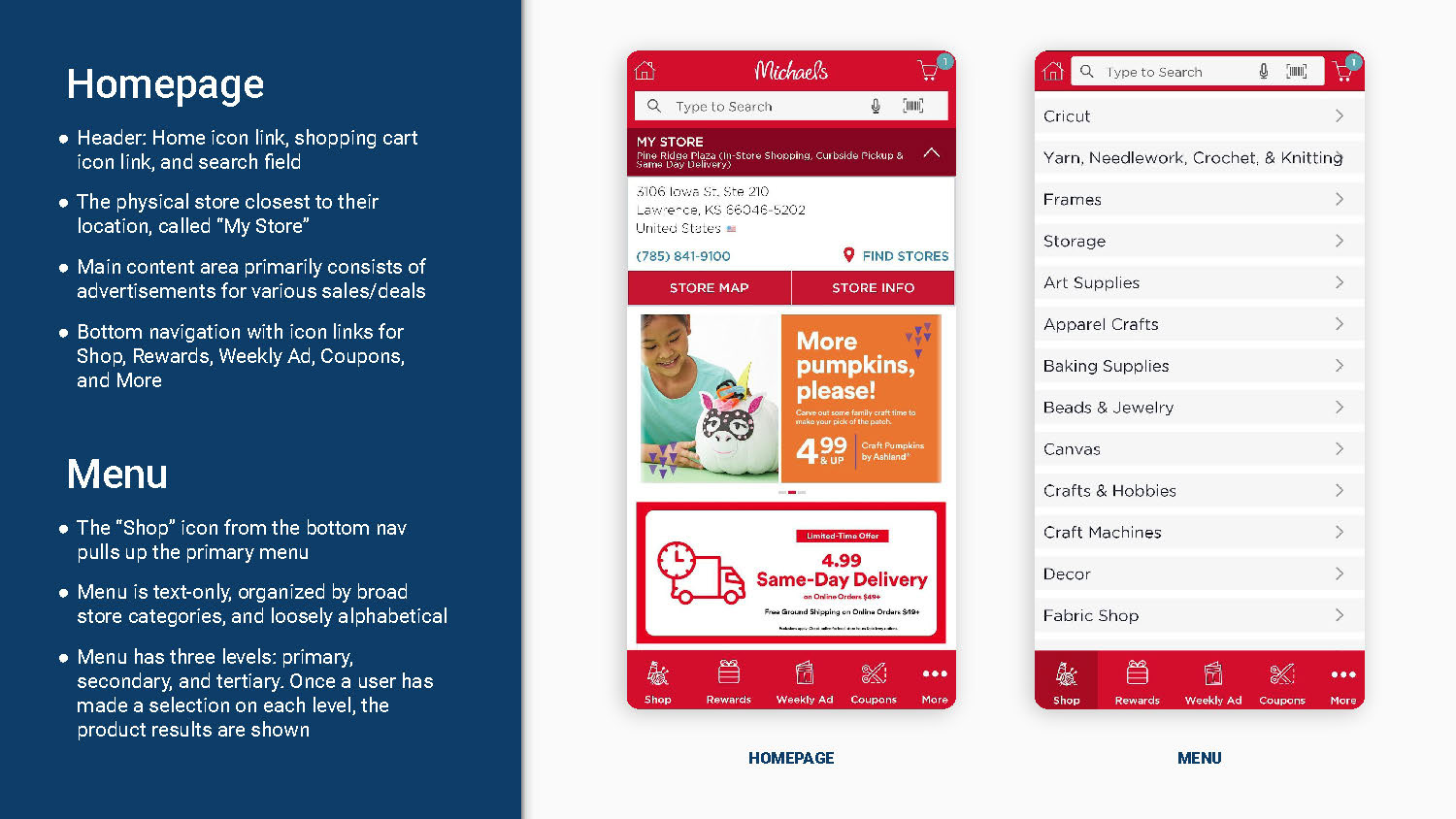
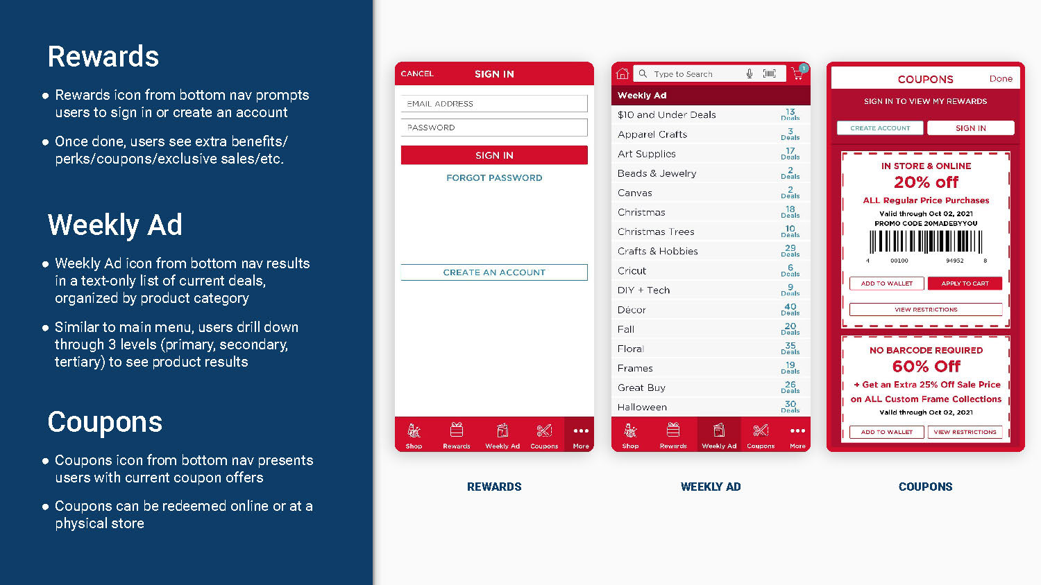
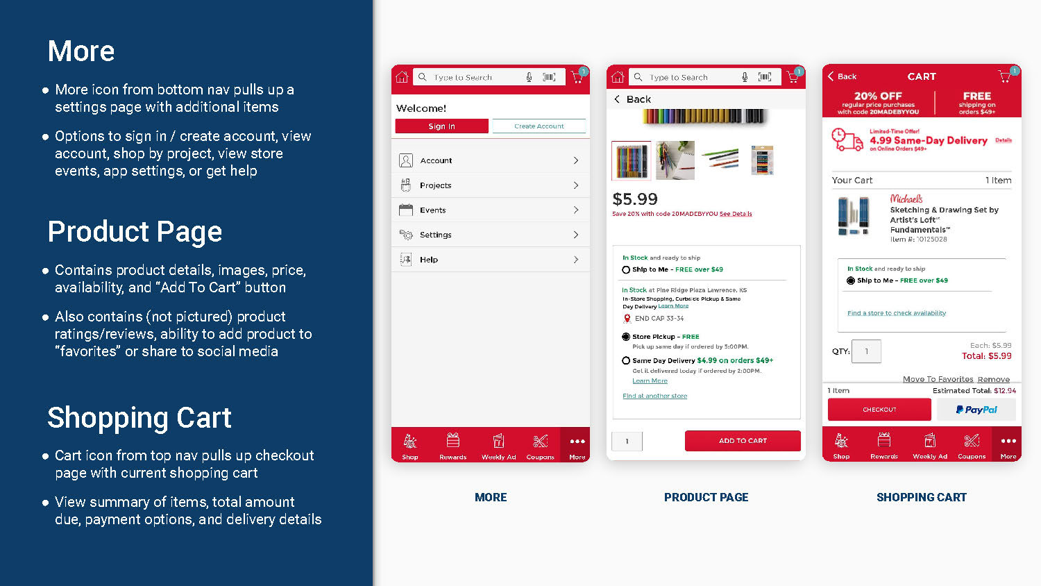
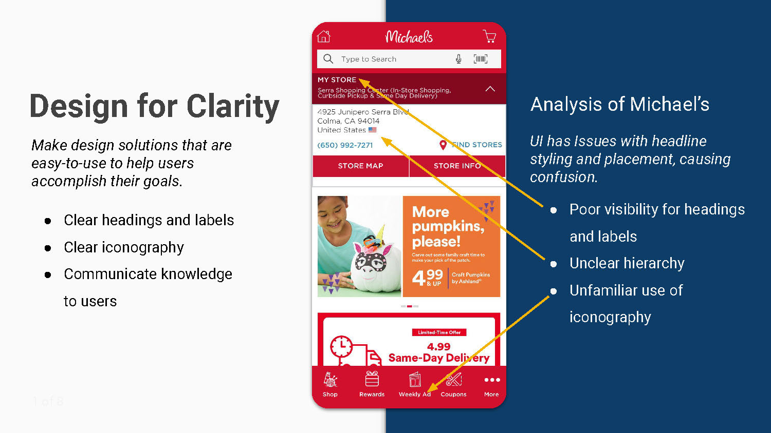
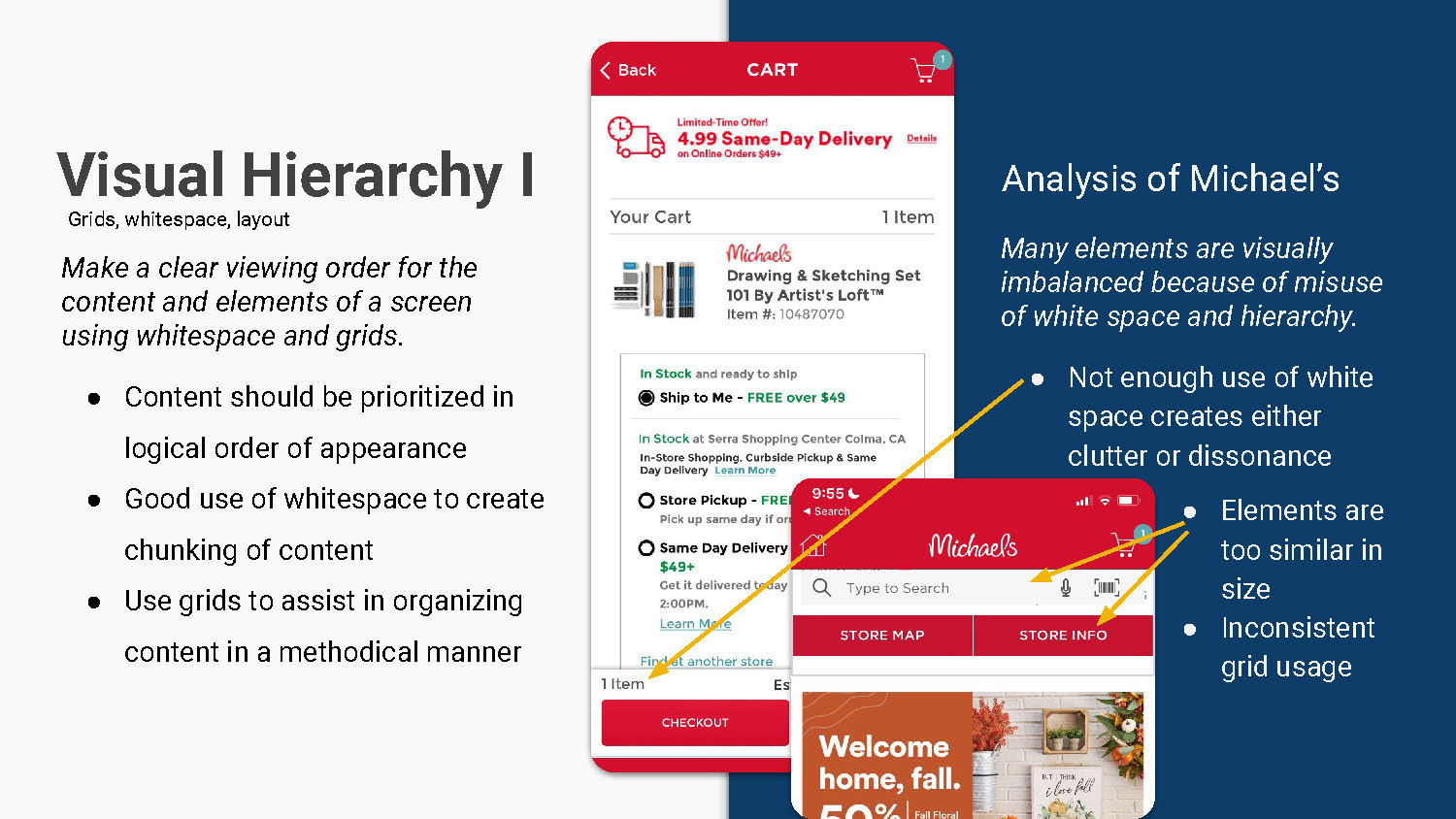
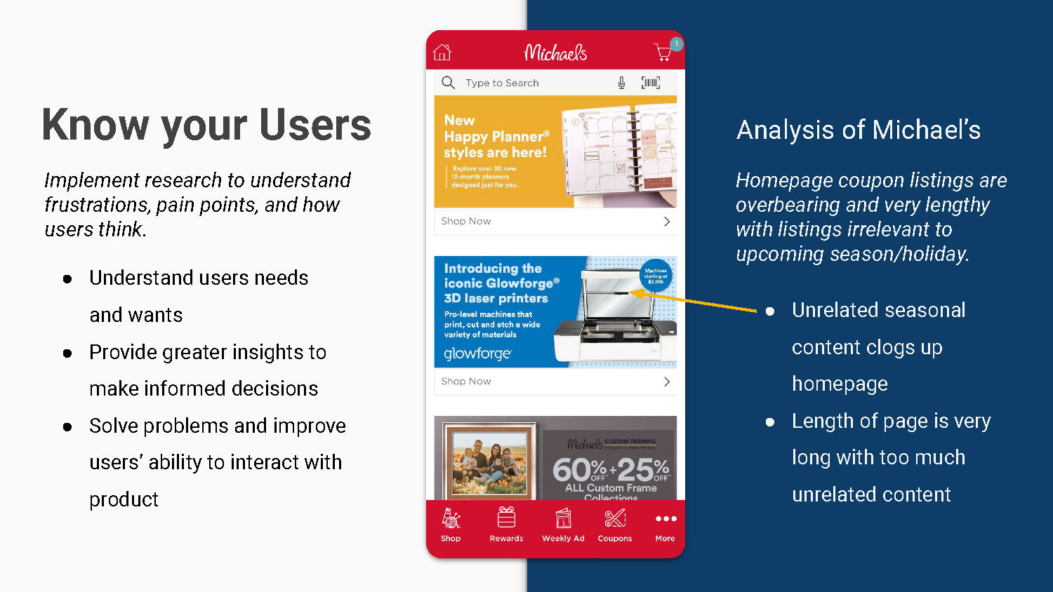
All five members of our team evaluated the Michaels mobile app for usability and design. We put our analysis and recommendations into a Google Slides presentation.
We found issues with clarity, visual hierarchy, user knowledge, motion control, user attention, the zero state, information architecture, the color palette, and the typography. To see the raw data or full evaluation, click the button below.
Competitor Evaluation
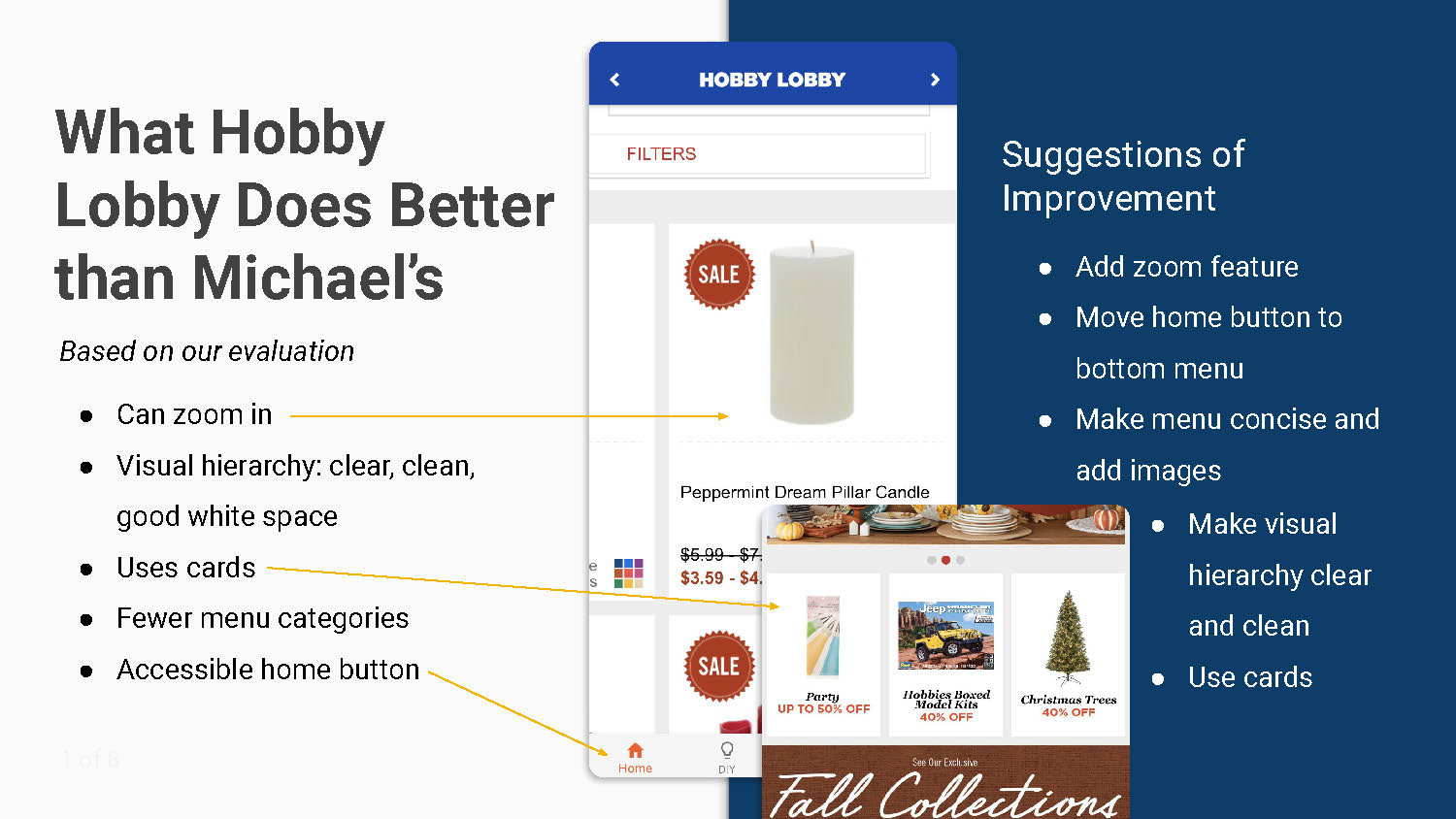
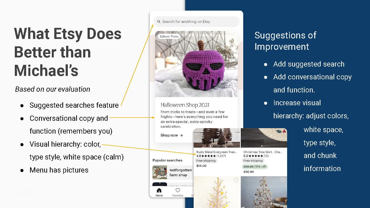
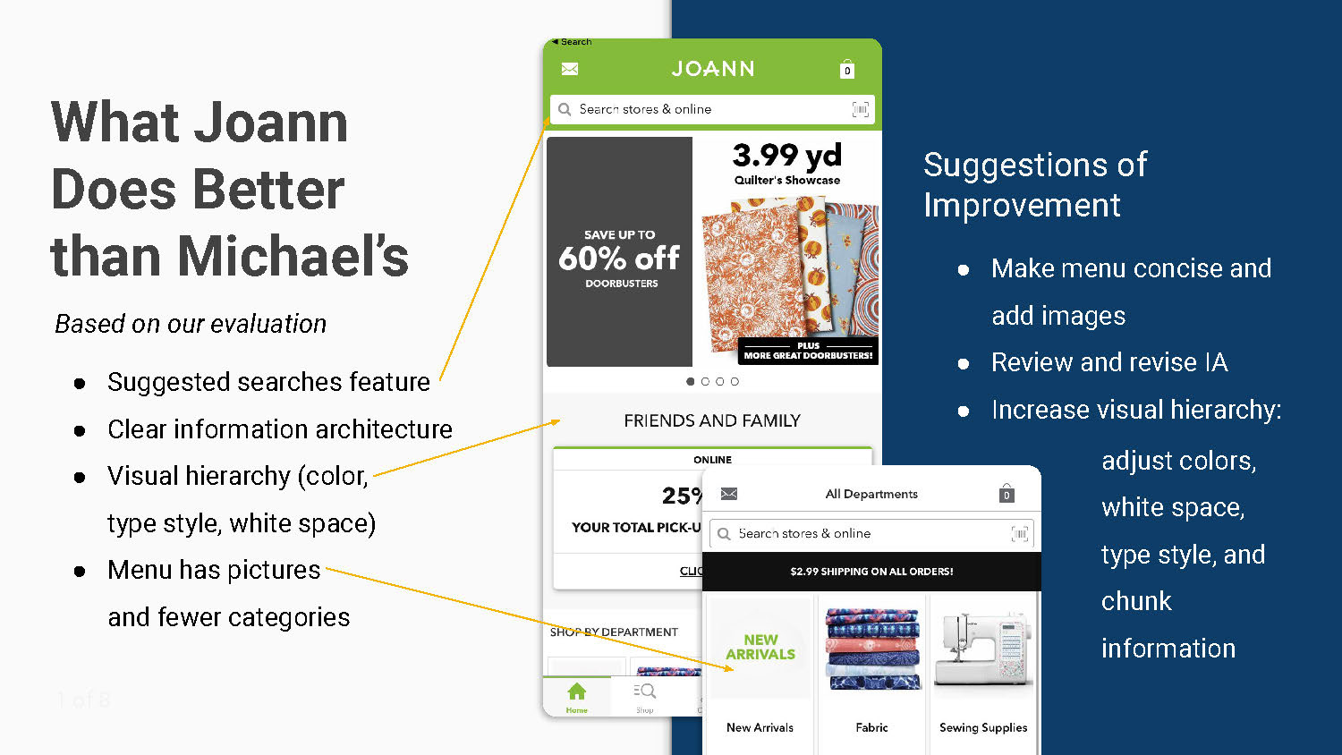
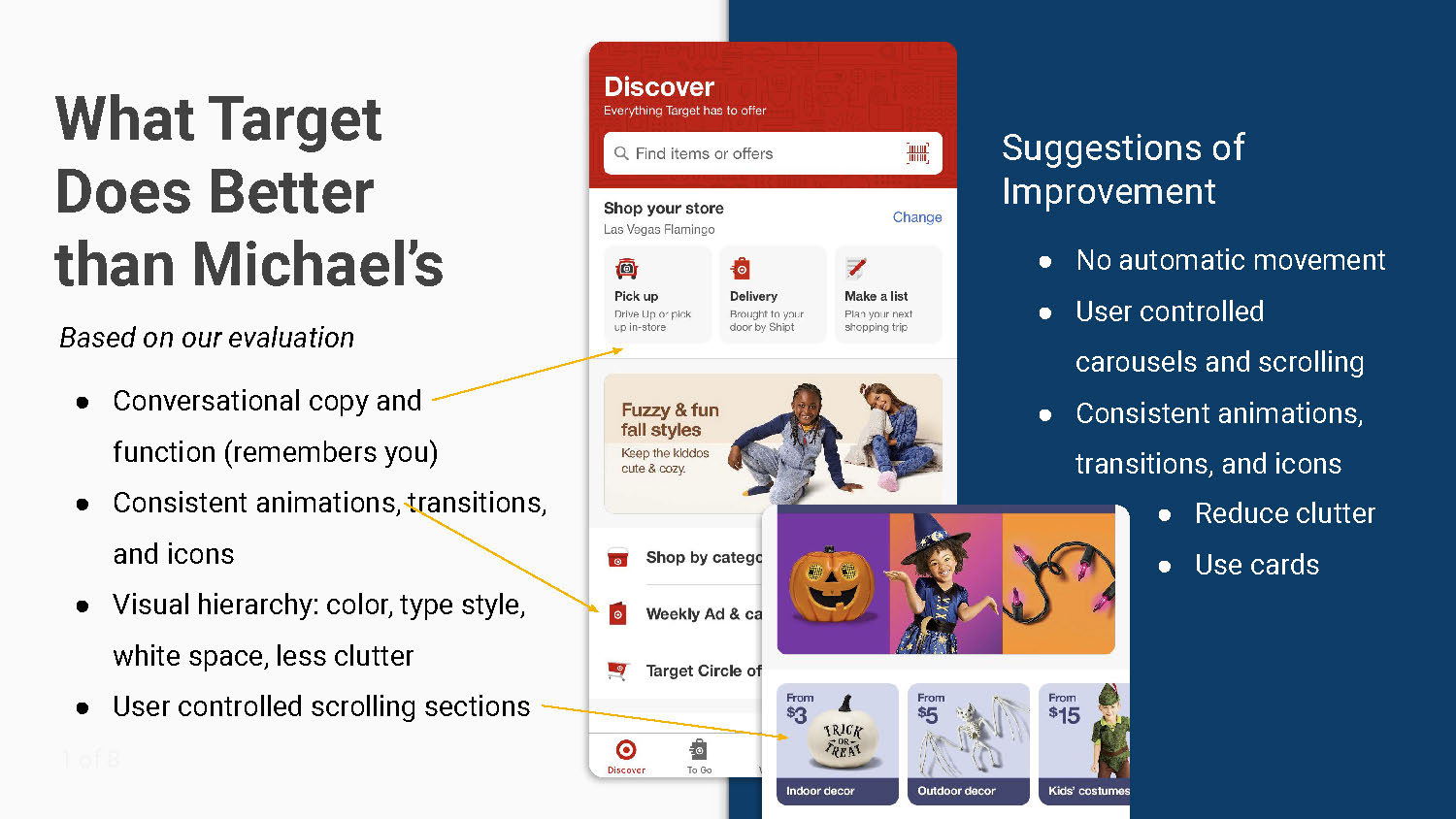
A brief look at the mobile apps of Hobby Lobby, Etsy, Joann, and Target in comparison to Michaels' app interface design and usability.
User Testing
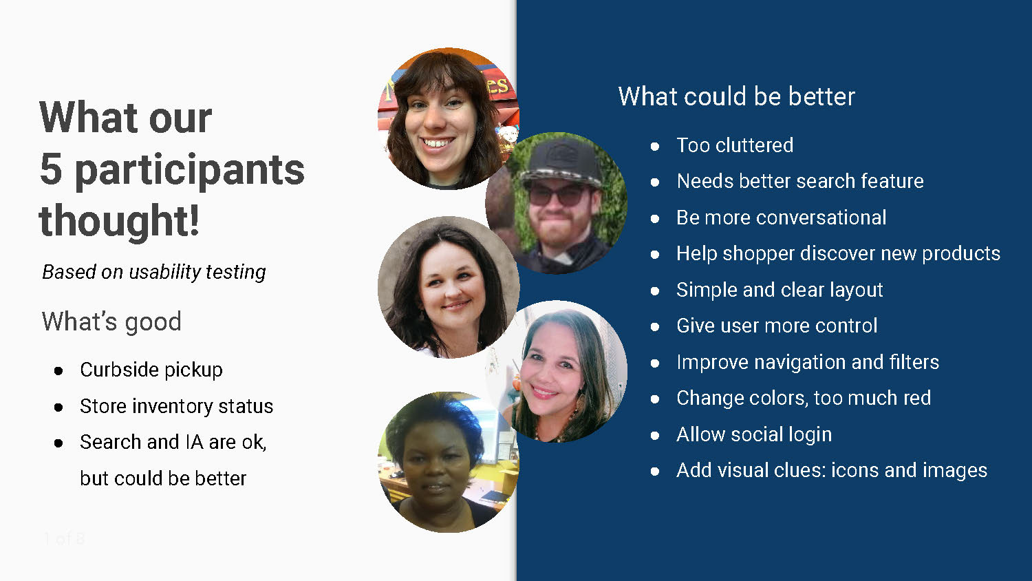
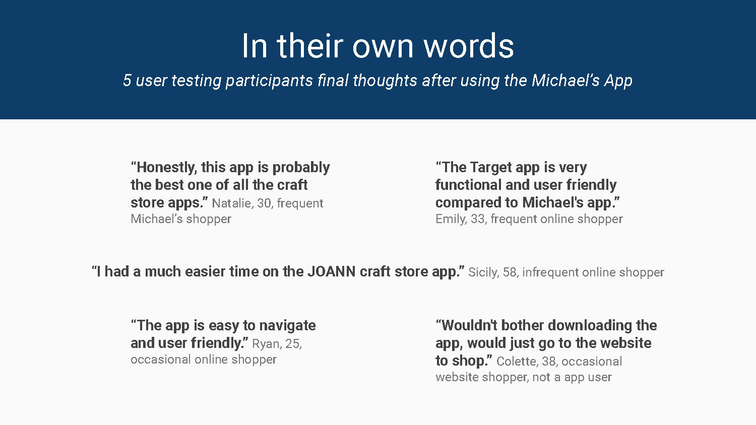
We had 5 participants between the ages of 25 and 58 test the Michaels app.
UX & UI Recommendations
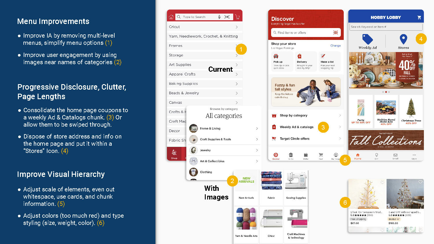
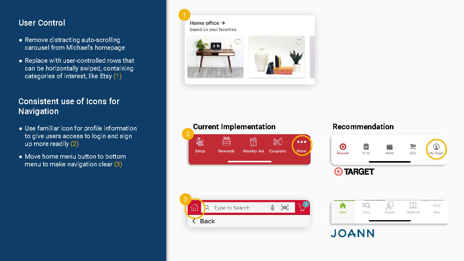
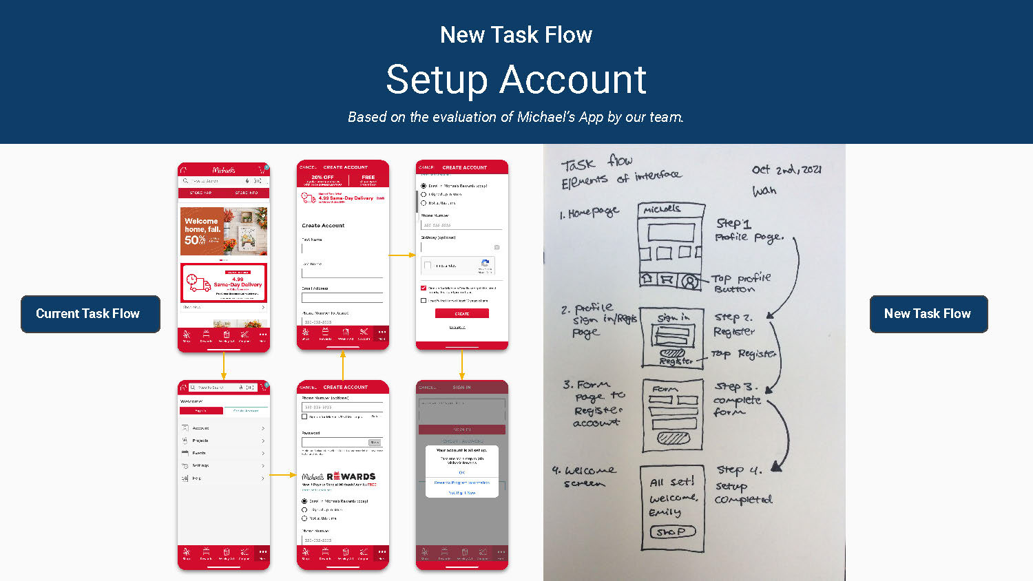
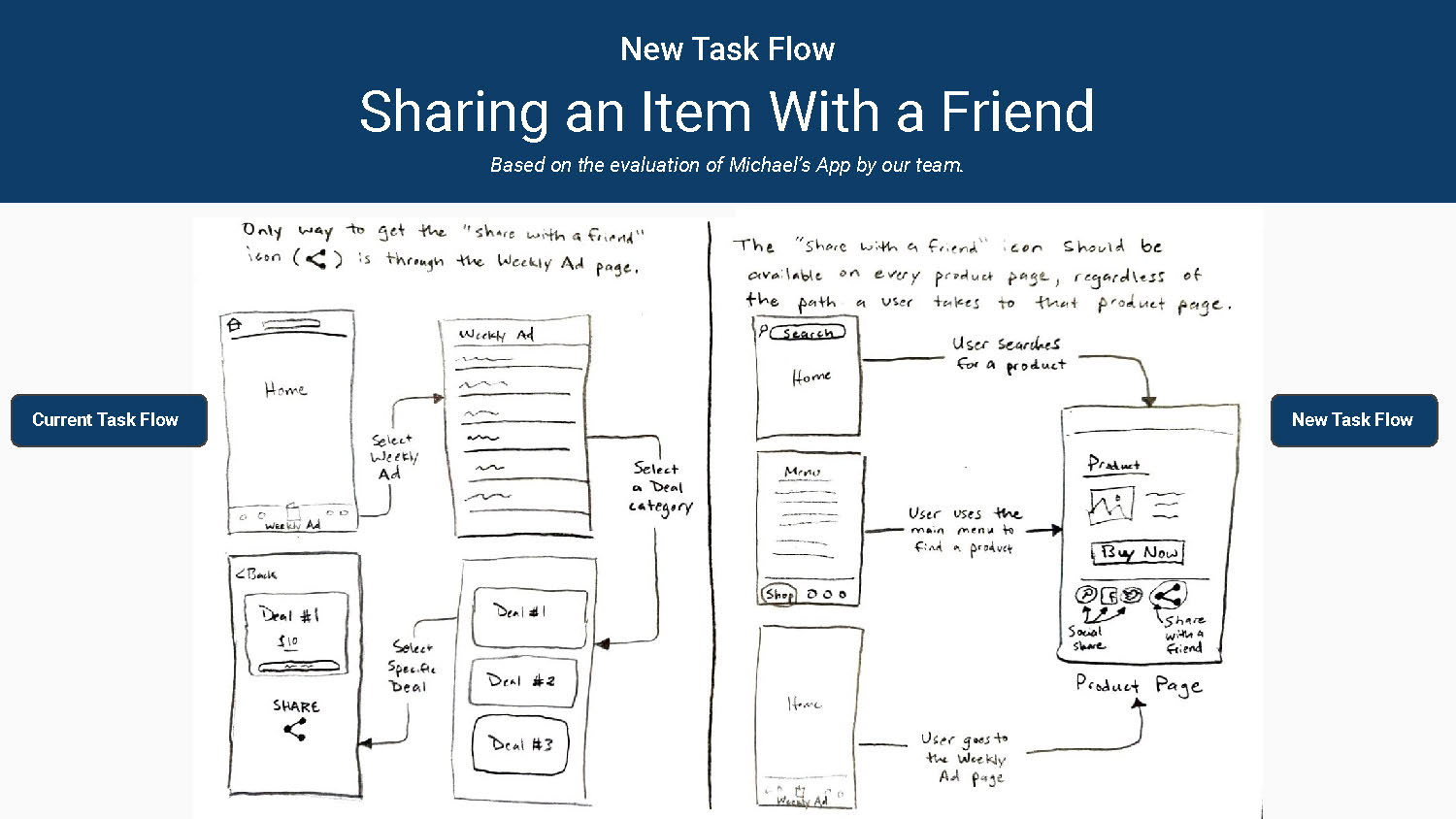
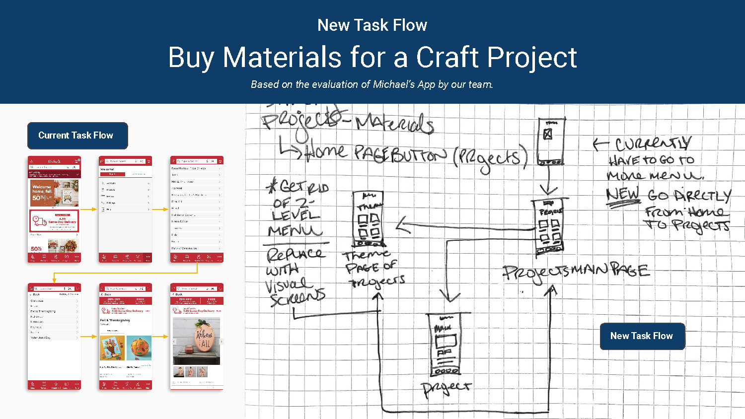
A high-level overview of recommendations based on tasks performed by participants and the team. Includes menu improvements, progressive disclosure, clutter, page lengths, visual hierarchy, user control, and consistent use of icons. We are also recommending three revised user task flows—account setup, sharing, and buying materials for a project.
Design
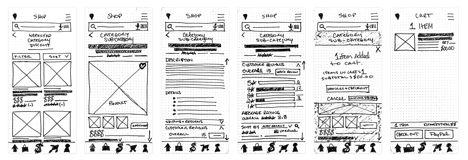
Sketch Wireframes & Prototype
Homepage, projects, deals, categories, cart, and menu options.


Would you like to preview the interactive Marvel sketch prototype?
Test out the working prototype below.
Prototype Usability Testing
All three participants found the redesigned prototype of the Michaels app to be easy to use, to work better, and to be clearer than the current Michaels app. There were only a few minor usability issues, see the full report by clicking the button below.
The test identified a few places the prototype is working:
● They liked the visual screens for finding products better than the current text-only
menus.
● They like the new location of the menu and cart buttons.
● They thought the design was clean and well laid out.
● They liked the use of horizontal scroll and the use of three items horizontally in
comparison to one to save vertical space.
The test identified minor problems including:
● The text was too small in some areas.
● The bottom menu needs labels in addition to icons, at least on the home screen.
● The bottom menu icons need to be adjusted for clarity.
● The number of steps required to complete task 3 might be too many.
● Apple Pay should be added to the payment options.
● Back buttons should be on all screens.
● The location finder should be labeled and the feature worked out if time.
The test confirmed a prior finding:
● The current app uses too much red.
Lo-Fi Wireframes & Prototype
Five improvements were made incorporating feedback, this version was built in Balsamiq.
1. Added breadcrumb navigation.
2. Search bar now at the top of every screen.
3. Added a search results page.
4. Added a shop page with links to all categories and individual top products.
5. New bottom right button to make it easier to use the site with one hand.
Would you like to preview the interactive Figma Lo-Fi prototype?
Test out the working prototype below.
Hi-Fi Wireframes & Prototype
Final Figma screens and prototype incorporating feedback from the Lo-Fi prototype.
Would you like to preview the interactive Figma Hi-Fi prototype?
Test out the working prototype below.
Prototype Usability Testing
All three participants found the redesigned prototype of the Michaels app to be easy
to use. The participants thought it worked well, was clear, and that it felt visually like Michaels. This was a test of a previous color Hi-Fi version than shown above. The screens and prototype above incorporate this feedback. There were only a few minor usability issues, see the full report by clicking the button below.
to use. The participants thought it worked well, was clear, and that it felt visually like Michaels. This was a test of a previous color Hi-Fi version than shown above. The screens and prototype above incorporate this feedback. There were only a few minor usability issues, see the full report by clicking the button below.
The test identified a few places the prototype is working:
● They liked the use of color and the number of images.
● They like the label and design revision to the menu buttons.
● They thought the design was aesthetically pleasing, well laid out, and
straightforward.
● They thought the functionality was great, it was easy to follow and easy to confirm
what they were buying.
● The nice pictures made one of them want to do projects. Which is great!
● They liked the break out of featured projects and that some more common project
categories are featured on the main project page.
The test identified minor problems including:
● The text sizing needs to be adjusted in a few areas for better balance.
● The vertical spacing needs to be loosened to allow for more white space and to
reduce the busyness.
● Adjust color usage and layout to refine where the eye is drawn and to reduce
stimuli.
● Refine the header to look less clunky.
● Add “see all projects” button and a project page showing all projects that allow
filtering for those who don’t know what category to look under.
● Adjust color and type styling of the home screen so that welcome and haunting aren’t so prominent.
Design System & Style Guide
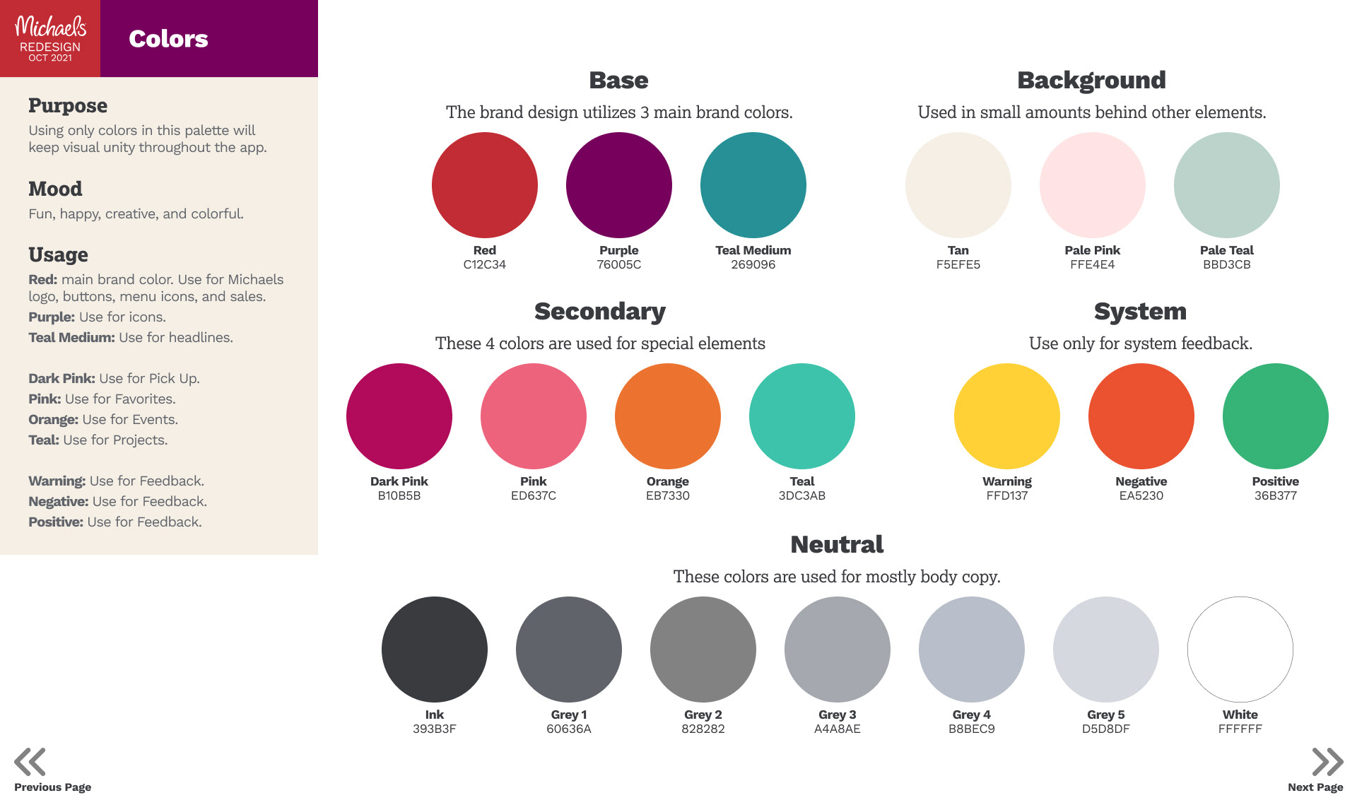
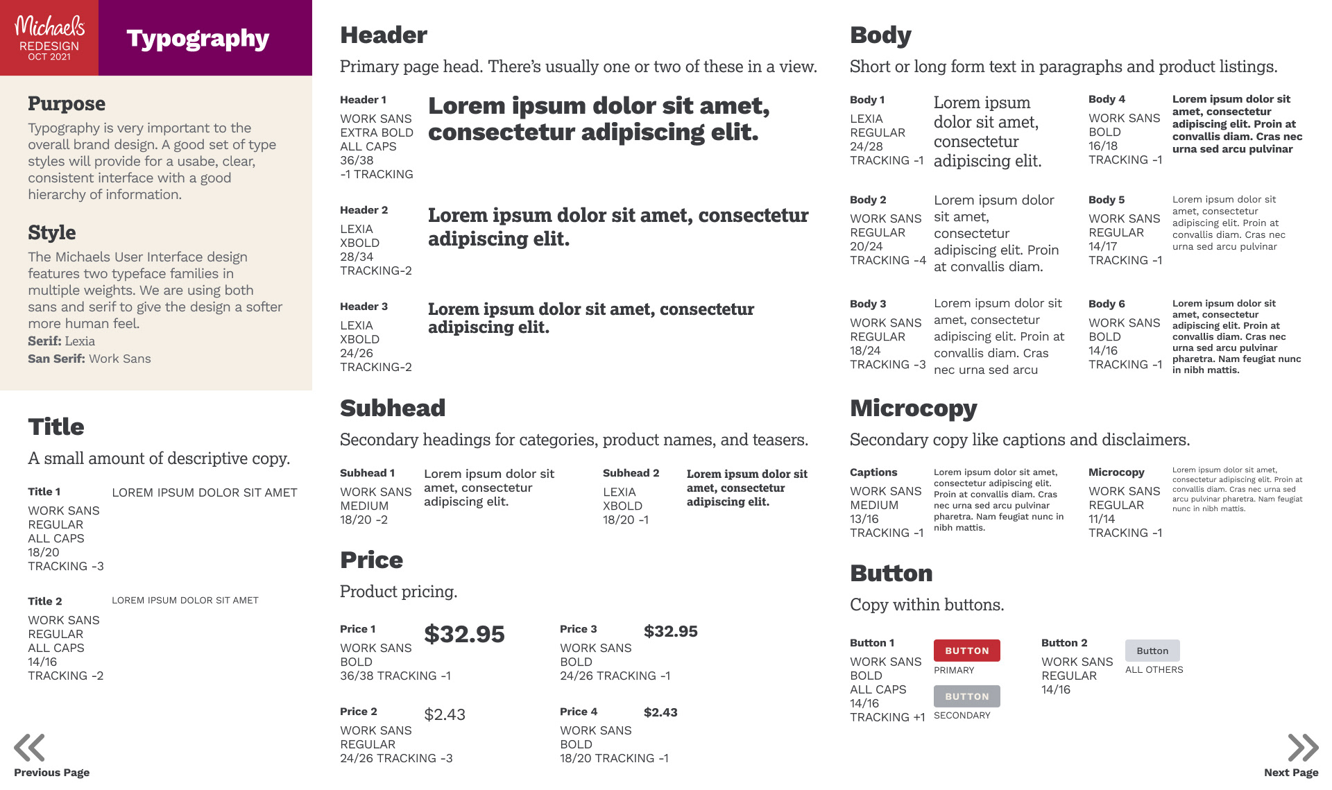
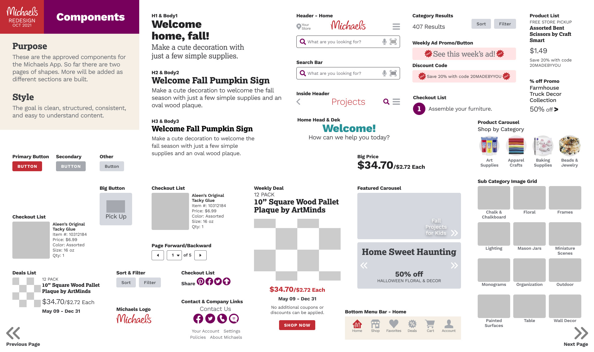
Full style guide for Michaels built in Figma for ease of use, containing colors, grid, typography, icons imagery, and components.
What I learned
Key Takeaways from User Testing
1. It is good to have a mix of types of participants. I had two women and one man each test since Michaels has a target market of women, with the occasional male shopper.
2. Internal team reviews are necessary and valuable. My teammates came at the problem from a different angle and gave different advice than the user testers. They were more focused on technical UI patterns, which was good feedback to get.
3. User testing remotely was my biggest challenge without a decent budget, but Google Surveys and Docs helped facilitate user testing for free.
4. App users are intelligent about the design of apps. All of my testers gave feedback about things designers are concerned about on a visual front like type and image size. They talked about what visually was or wasn’t working for them. They were pretty clear about what confused them. They also understood that bad app design is everywhere.
What I Would Do Different
1. I would do more in-person or paid testing. The realties of testing is that good testing costs money. It will be nice to do this for a company that has a budget in the future.
2. I also would have liked to have done some A/B testing on colors, images, layout options, and the information architecture to have data to back up the final designs.
3. I would design and prototype the remaining sections of Michaels' app.
Are you interested in working together?
I would love to hear from you!

