CASE STUDY
Tely
Increasing Telecom Customer Joy and Overall Satisfaction
The purpose of this project was to determine why users were unhappy with their telecom retail experience, brainstorm solutions to their pain points, and recommend a design direction.
To accomplish this goal I analyzed data, created an empathy map, wrote job stories, designed customer task flows, wireframed, built a UI design system and a prototype as proof of concept, and ran a usability study with six participants for feedback.
This is an in-depth case study of my design solution. If you would like to go back to the high-level version, please click the button below.
Home screen wireframe built in Figma.
PROJECT
In-store customer service app design concept to solve telecom customer pain points based on user research.
PROBLEM
Telecom clients are tight on time and have trust issues. They don't like to talk to associates if they can avoid it, particularly in the age of Covid 19.
*Steps taken were limited in scope.
*Steps taken were limited in scope.
SOLUTION
An in-store tablet that will tie in with the customer's existing account. They can complete common tasks on the tablet without speaking to anyone.
ROLE
Research & Design
Krista Volenski Wilcox
Krista Volenski Wilcox
Research
Wah Khalsa-Smith
Makara Vath
Christina Appignani
Wah Khalsa-Smith
Makara Vath
Christina Appignani
PROJECT ELEMENTS
Research & Discovery
Analysis of User Interviews, Empathy Map, Job Story Ideation, Storyboard, Site Flow, and Task Flow.
Analysis of User Interviews, Empathy Map, Job Story Ideation, Storyboard, Site Flow, and Task Flow.
Design
Wireframes, Prototype, UI Design System with Components, including Typography, Colors, and Icons.
Wireframes, Prototype, UI Design System with Components, including Typography, Colors, and Icons.
TOOLS
Pen & Paper, Google Suite, Figma, Illustrator, Photoshop, and an iPad Pro for Testing.
Preview the Tely App Design Below.
Research & Discovery
Empathizing with Customers Interviews with four customers were analyzed for pain points in the telecom experience. My design solutions are based on Dan's needs, desires, and frustrations.
Job Story Ideation
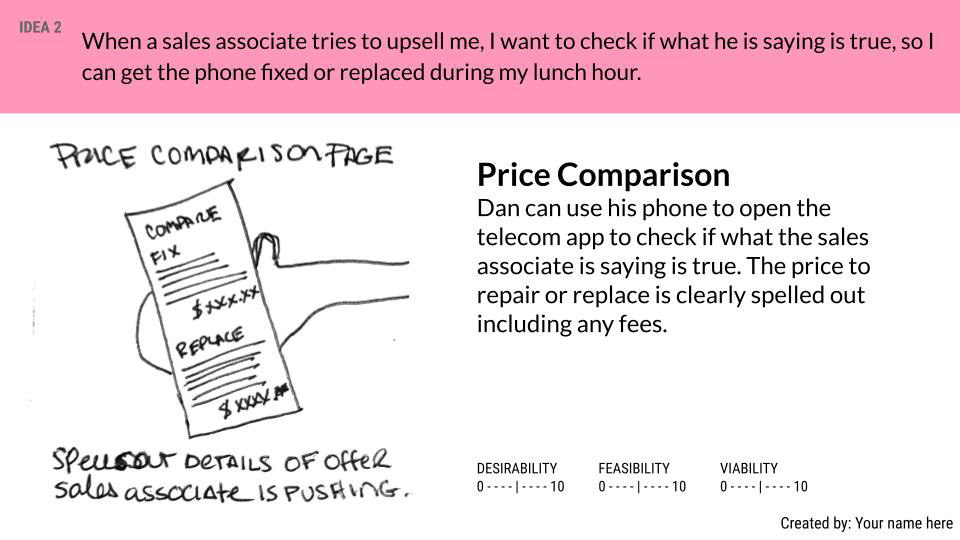
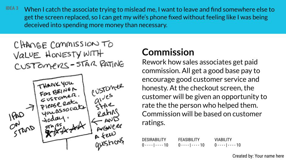
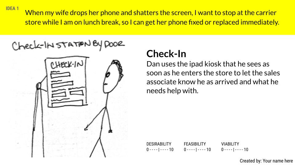
Our team used the job story method of ideation to kick off the design for this project. We put our analysis and recommendations into a Google Slides presentation.
I generated 25 ideas, five ideas under each of the five job stories I wrote based on customer research.
I pitched ideas for in-store tablets, kiosks, websites, and mobile apps to address issues with customer time available, speed of fact-checks and product comparisons, customer trust, reviews, data transfers, and sale transactions. To see the five job stories or full ideation presentations, click the buttons below.
Customer Task Storyboard
A brief look at Dan's fictional experience interacting with Tely, his telecom retailer, when he needs to fix or replace a broken phone. The best solutions from the ideation round were used here to show how they could improve the overall customer experience.
Site Flow & Task Flows
Once the site flow was determined, I planned three possible user flows for this project.
Task Flow 1: Check-In
Task Flow 2: Repair or Replace Device
Task Flow 3: Restore Data from the Cloud
Design
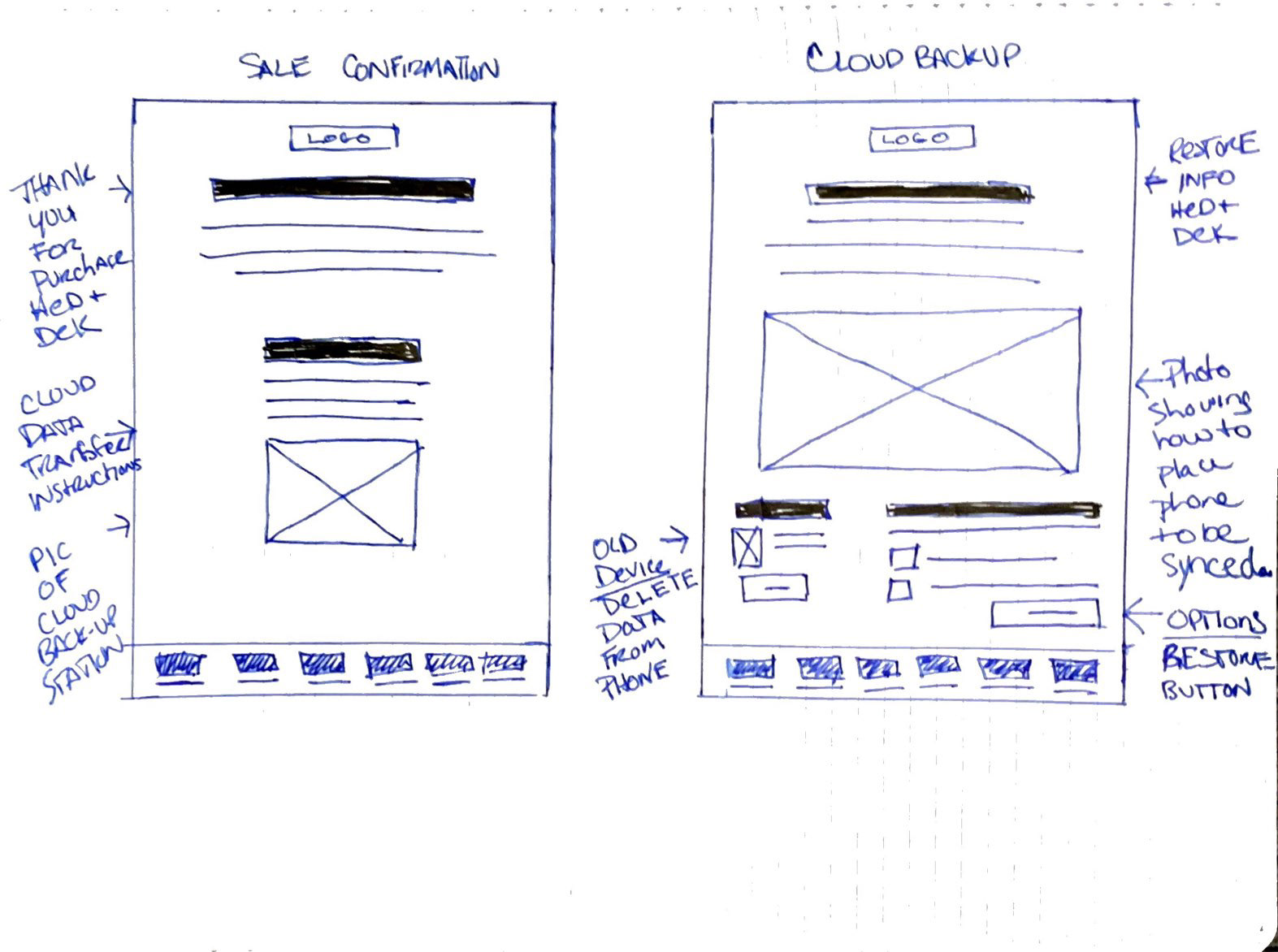
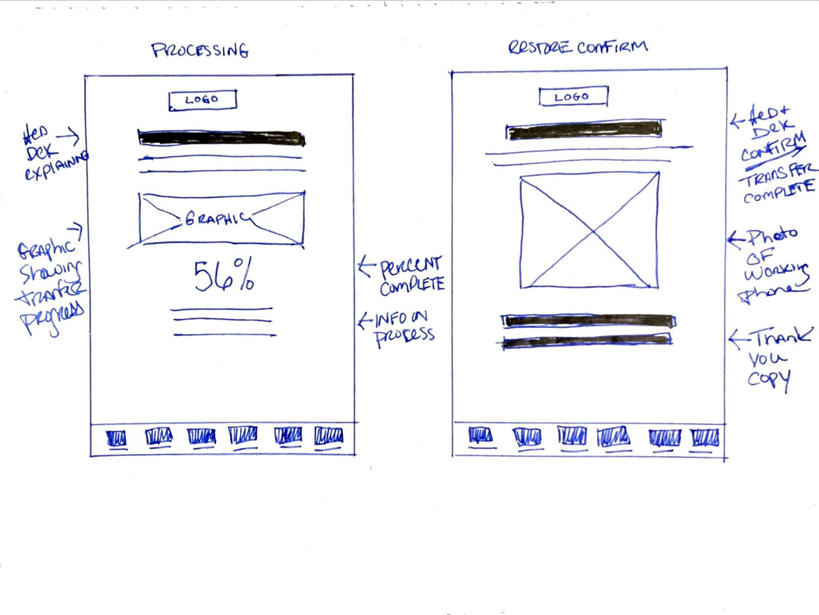
Sketch Wireframes Sketched ideas for home, sign-in, check-in, pricing, replace, repair, device, cart, review, sale, cloud backup, processing, confirmation screens. Includes new menu and icons.
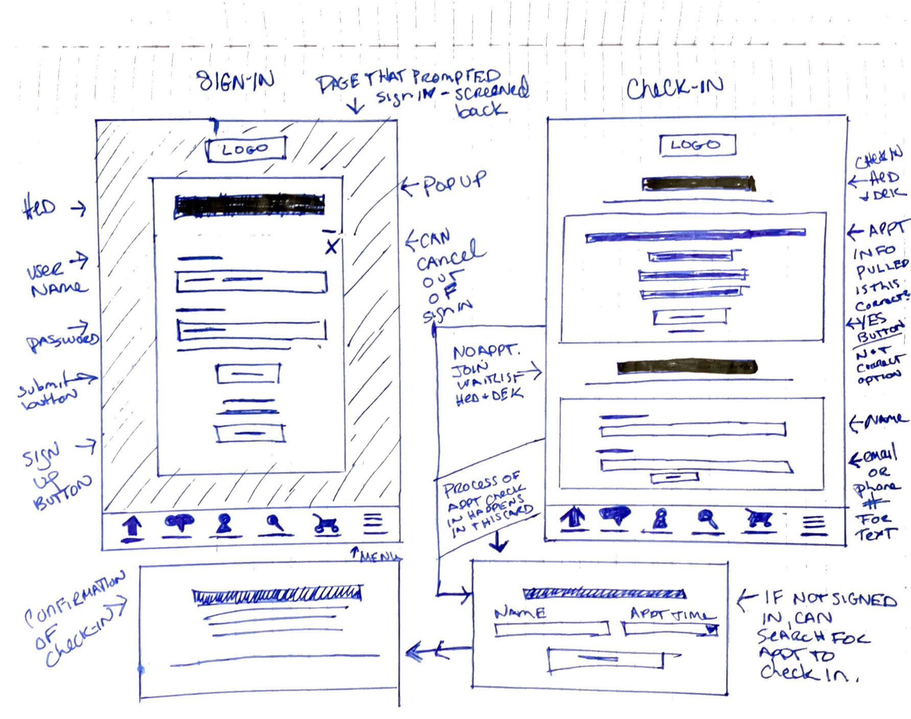
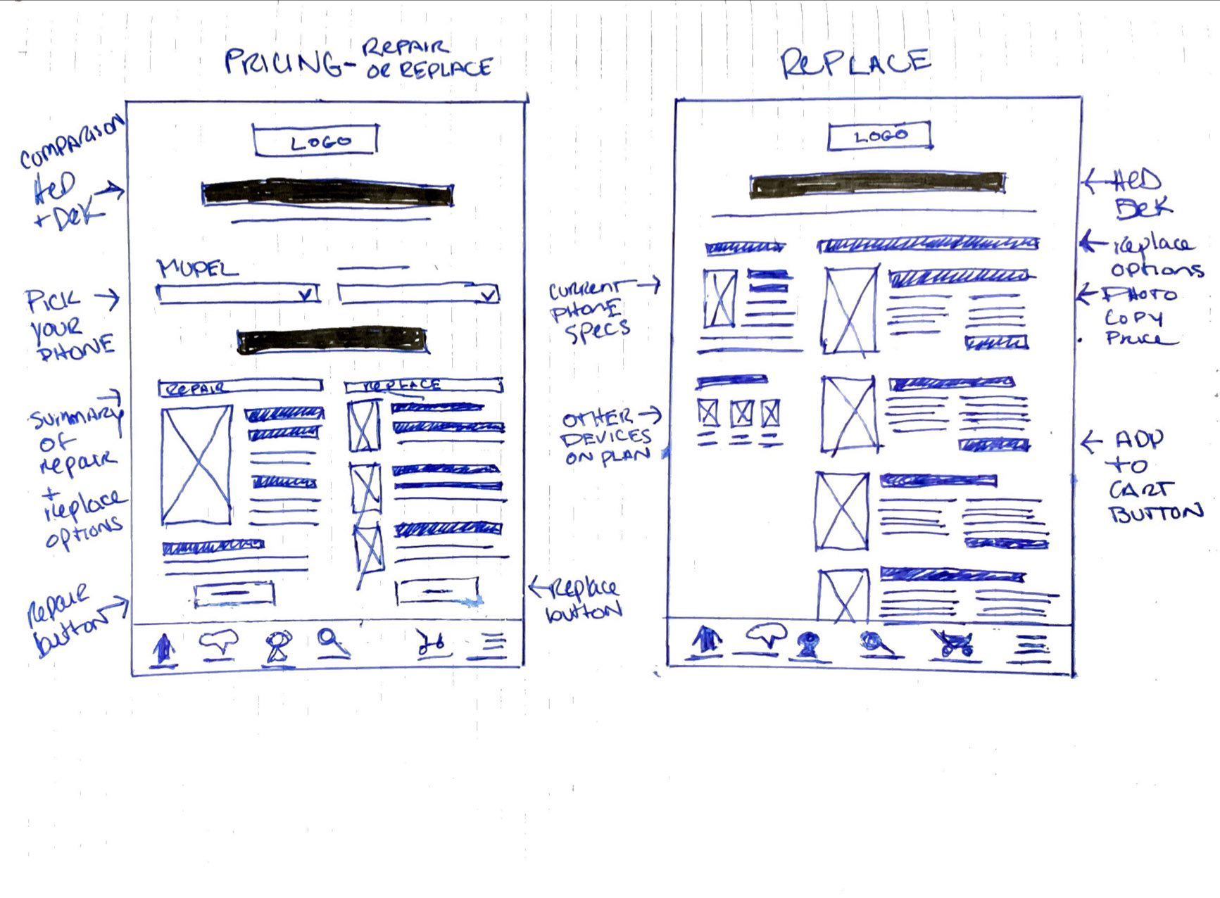
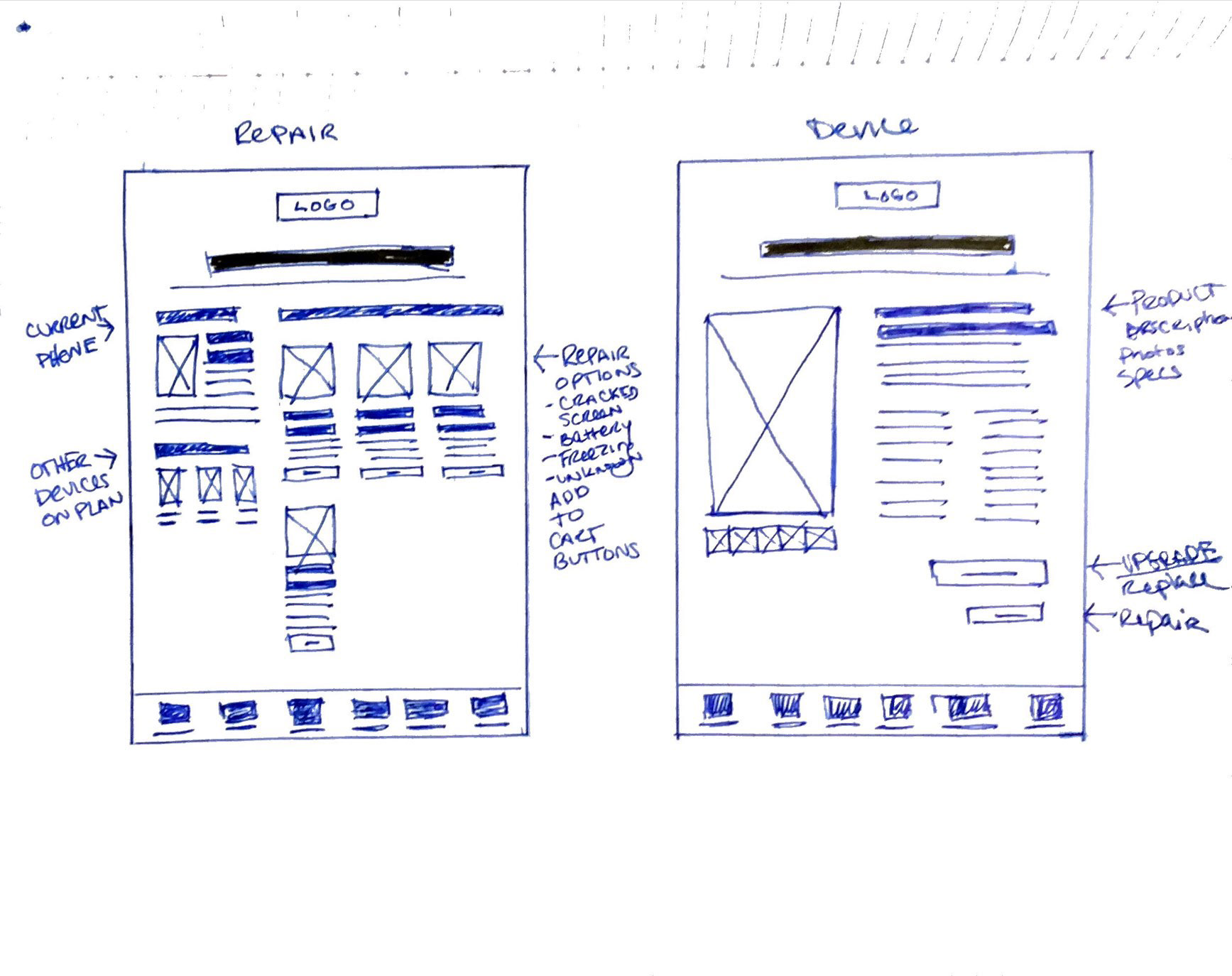
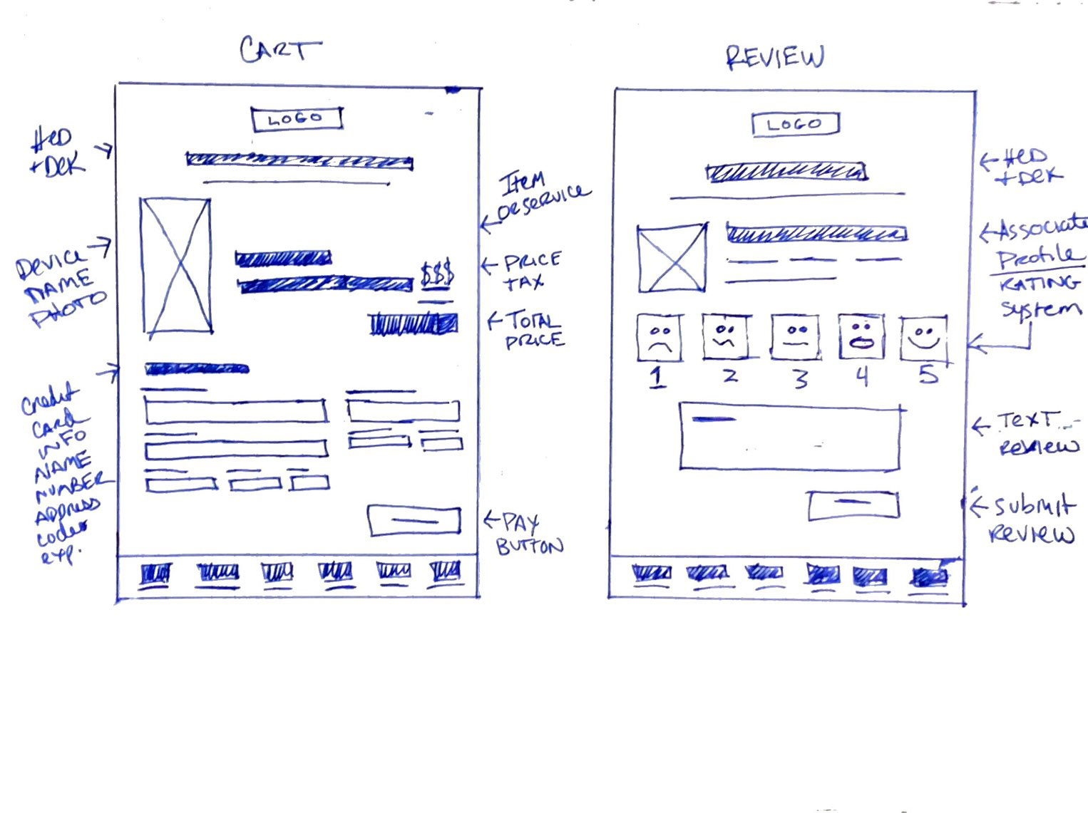
Lo-Fi Wireframes & Prototype Testing
Built wireframes in Figma, started a design system, created a B&W prototype, and tested it with my team and three participants. To interact with the prototype, see below.
Would you like to preview the interactive Figma Lo-Fi prototype?
Test out the working prototype below.
Hi-Fi Wireframes & Prototype Testing
Improvements were made incorporating feedback from my team and user testing. Typography styles, the color palette, interactions, images, and icons are set. This prototype was tested with six participants and a usability report was created. To interact with the prototype or to read the full usability report, see below.
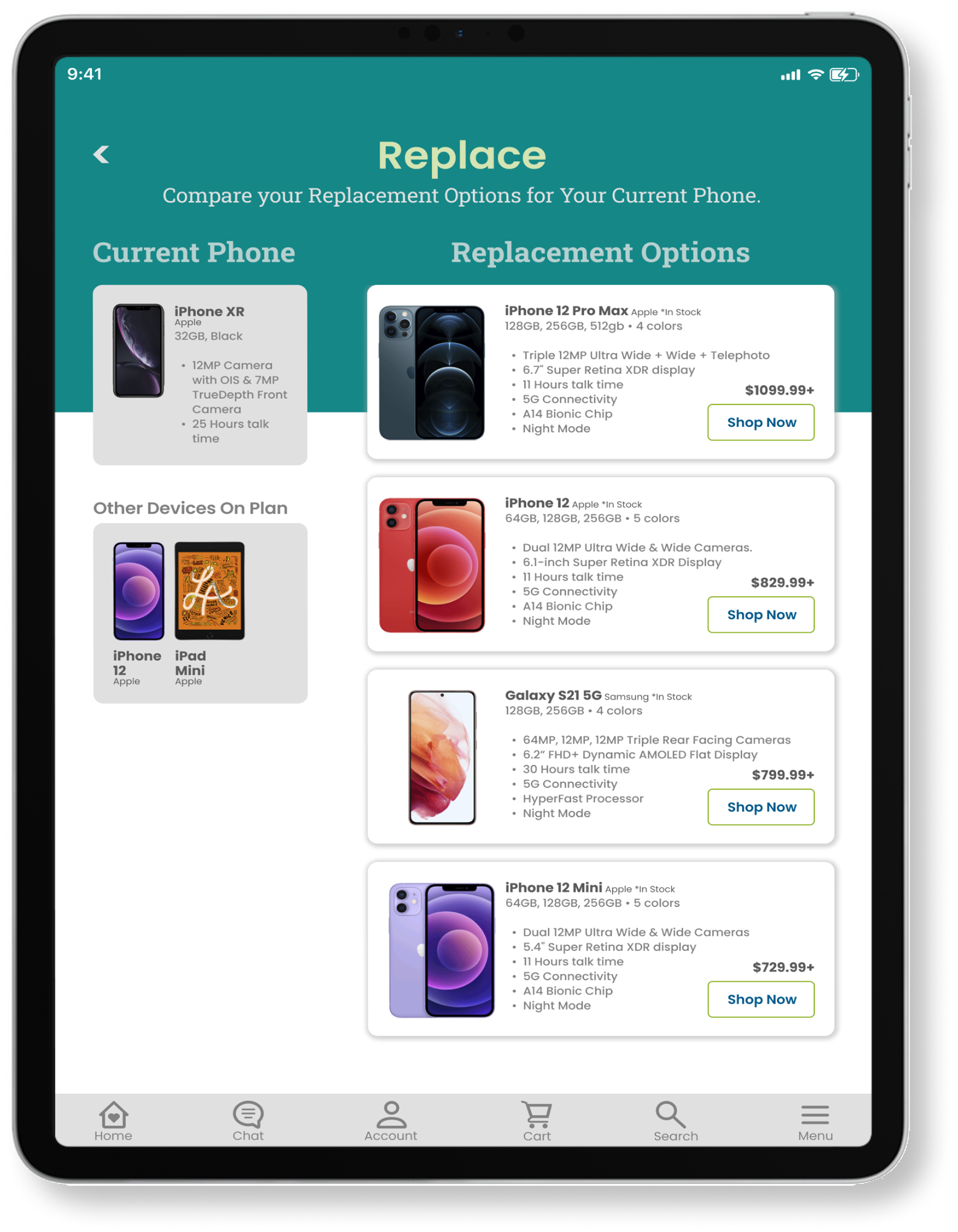
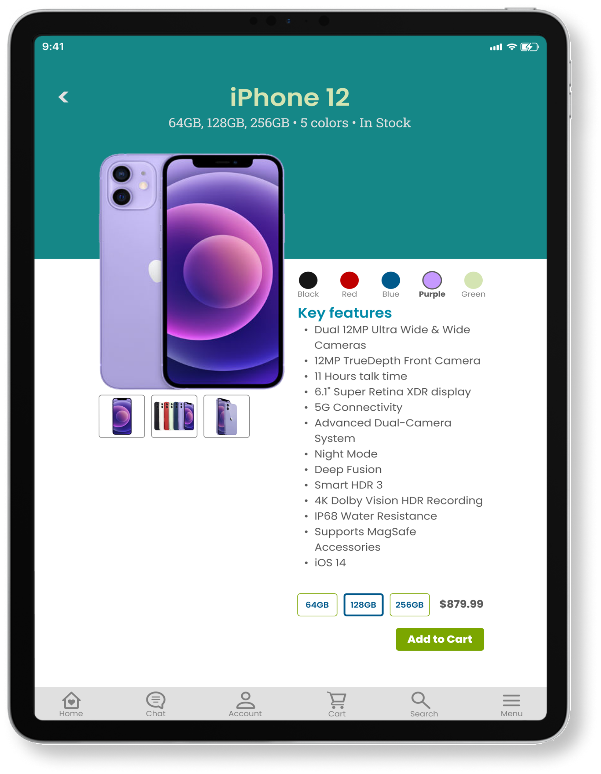
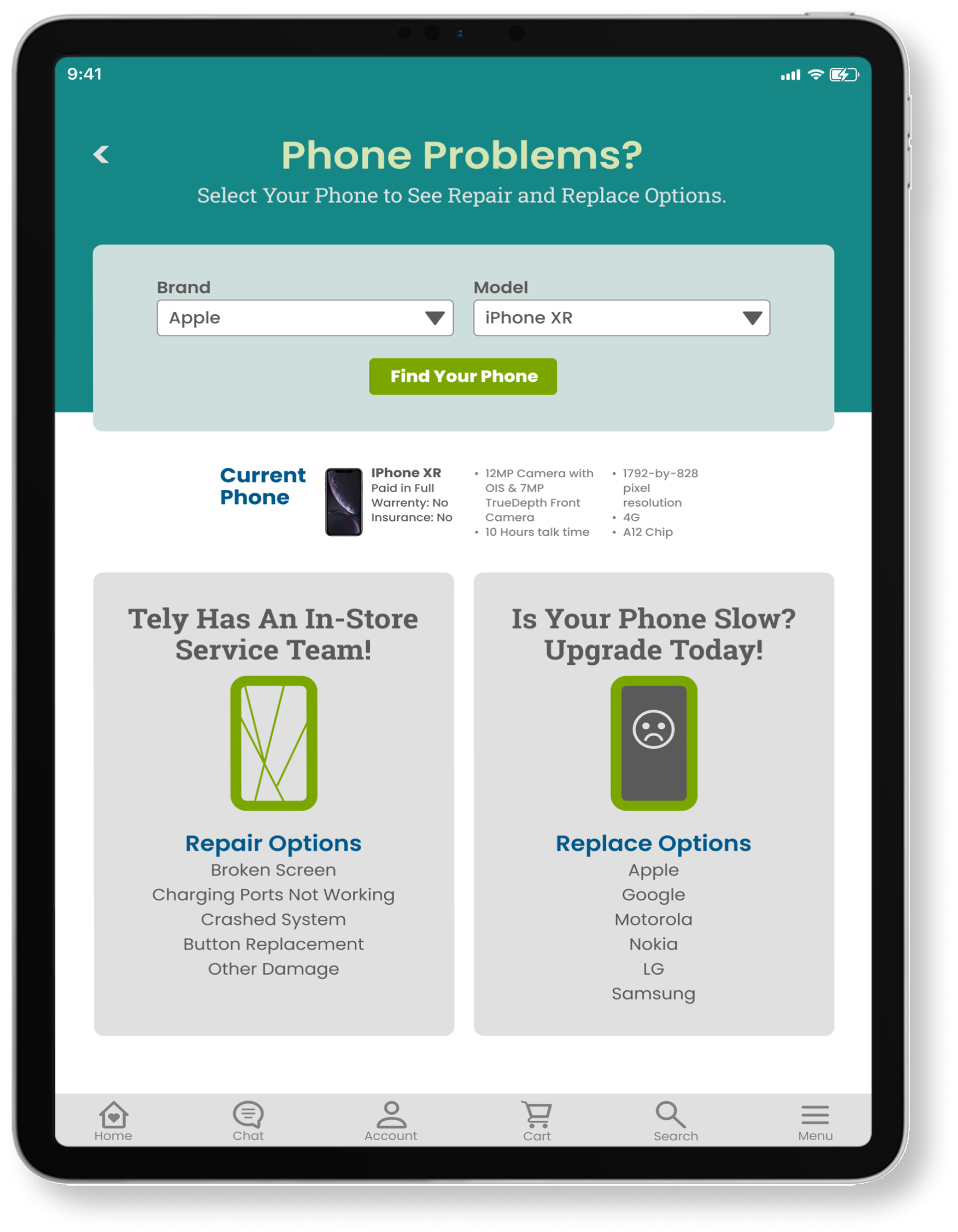
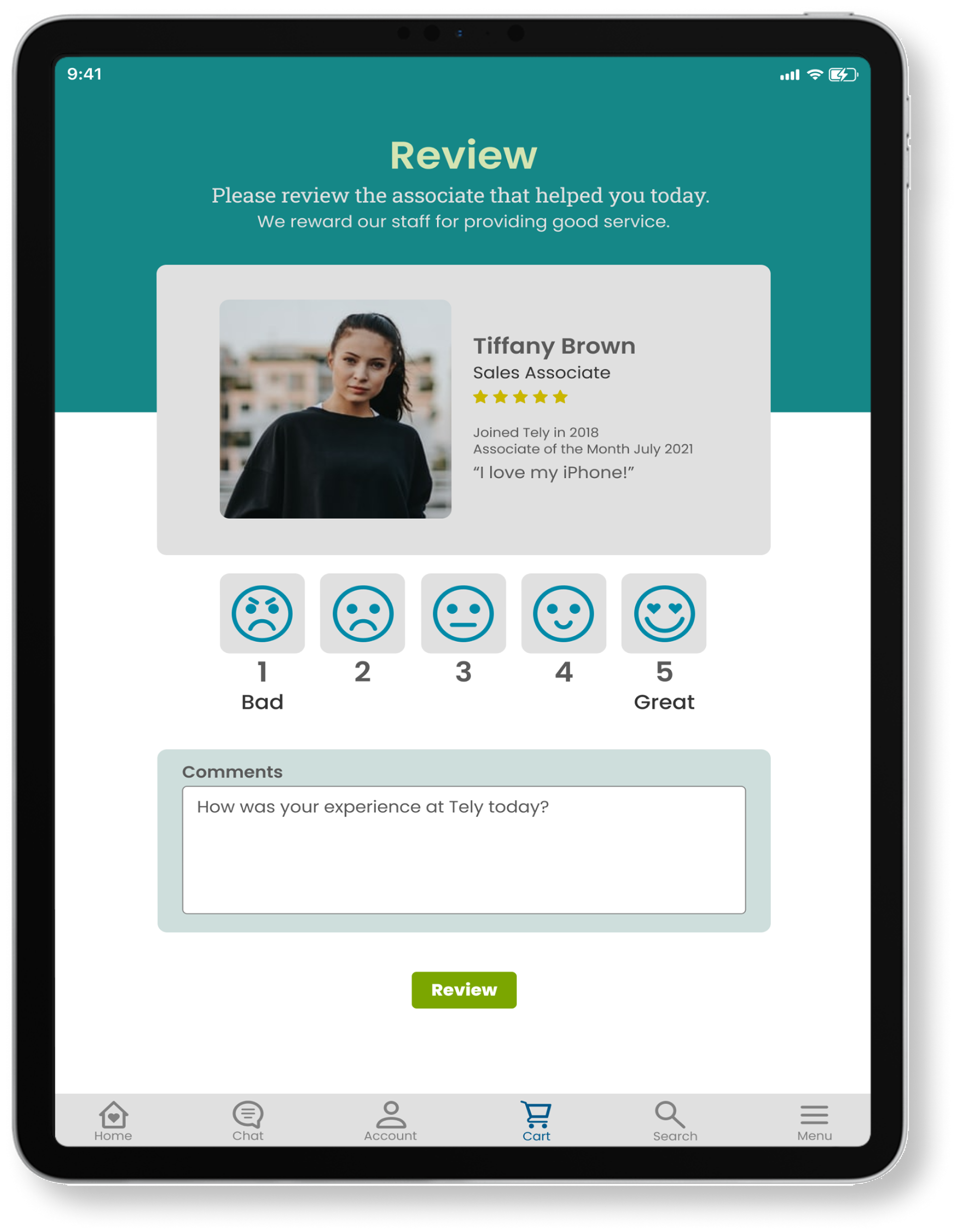
Would you like to preview the interactive Figma Hi-Fi prototype?
Test out the working prototype below.
Hi-Fi Prototype Usability Testing
Six participants between the ages of 23 and 70 found the Tely App valuable and worth recommending. They felt above average about the app and found value in all three features, but considered the check-in feature the most valuable.
The test identified minor problems including:
● Confusion over the circle with an arrow in it on the check-in page. User 2 thought it was a button, it isn't.
● Confusion over how to use the QR code sign-in.
● A desire for a photo of the associate. "Add a photo of what the employee looks like so I know what the person helping me looks like and am not so annoyed with a complete stranger just starting to talk to me."
● Confusion over the flow of the tasks, there needs to be more step by step for less advanced users.
● Security concerns over the shared devices and accessing the cloud.
● Request for an easy-to-access call a rep button.
Design System
Created a design system for Tely built inside Figma for ease of use. Includes a brand logo, colors, grid system, typography styles, icons, and components.
What I learned and Next Steps
This was the first time I used job stories to ideate and wrote a usability report after testing. I was part of an active team that provided ongoing feedback for my designs. I know the Tely app design is better for being pushed to continue to iterate.
I love it when new projects allow me to expand my skill set. Every time I learn something new in UX it filters through to how I approach other parts of the design process. Learning about job stories helped me to improve my process of brainstorming ideas.
Key Takeaways from User Testing
1. There is still room for improvement in this app design as my usability test points out. Since app design is an ongoing process, I’m planning to do another round of iteration to make some of the changes noted in my report when time allows.
2. Good user testing for app development can be expensive, budget affected my feedback in my user testing. I would like to do more in-room testing when possible.
3. The feedback I got from my team and user testing was very valuable in allowing me to get a full picture of what was working and what wasn’t working in the Tely app.
Are you interested in working together?
I would love to hear from you!

